This past weekend, the 3rd Annual Portland Fine Print Fair took place, at the Portland Art Museum. If you’ve never been to a print fair, basically art dealers bring their wares, set up a booth, and if you’ve got the money, honey…
There are always a ridiculous amount of unbelievable prints by remarkable artists at things like this; last year had my jaw dropping at a number of Whistlers, this year was a booth that had ukiyo-e by artists like Hiroshige. But another print caught my eye, one by Australian printmaker Martin Lewis, titled “Spring Night, Greenwich Village.”
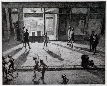
I apologize for the smallness of the image, there are bigger ones on the ‘net, but I didn’t want to step on toes.
In the era of the screen, one thing that people don’t seem to realize is that there is literally nothing like seeing the original piece of artwork. Photography and pixels cannot accurately reproduce the subtleties of paintings and prints and pottery. Yes, a jpeg is better than nothing, but when you’re limited by resolution and the size of your screen, you are always dealing with an imitation of the real deal.
The reason that this really hit home (again) for me was that, in a printmaking class I took a few years back, one of the class assignments was to reinterpret this very Martin Lewis print. We all had intimate familiarity with the image (or at least a reproduction of the image), and the techniques Lewis used to accomplish this beautiful print (mainly drypoint, for those wondering), so getting to see an actual impression made from the actual plate that Lewis worked on is like having the world suddenly snap into focus after years of being slightly hazy.
I ended up discussing the print with another patron at the fair, who was confused by Lewis’ use of sandground (which I am unfamiliar with, and suppose it’s a relative of softground and responsible for some of the texture on the sidewalk and street). I also explained that the rich (so rich!), velvety blacks on the image were from drypoint, applied insistently. We both marveled at the image for a minute or two after I had explained that this very print had been one of my student assignments.
It might seem that something like an intaglio etching, which is primarily produced in black and white (even that’s erroneous, as there are dozens of different shades of black ink, each distinguishable from one another), would survive reproduction without much loss of detail, but when you compare something that you know pretty well via reproduction to the original, the reintroduction to something you thought you knew (but with MORE) can be intense and delightful.
For comparison’s sake, here’s my version of this print, which I titled “Crossover.”
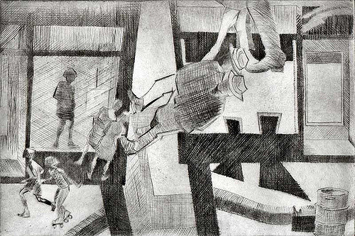
As it turns out, drypoint is a very difficult technique to master!
c.
