Born and raised in western Canada, I have been interested in the prints and sculptures created by the Inuit artists of Canada for many years. This documentary about one most revered Inuit artists, Kenojuak Ashevak, was originally only available on the National Film Board of Canada’s website. I was happy to recently discover the 1964 video on YouTube. Hopefully, that means it will be available for many years so others can appreciate the rigors of travel across the snow-covered landscape by dog sled and spending the night in an igloo.
The documentary also shows how Kenojuak’s drawings are carved into stone and printed. Kenojuak Ashevak became the first woman involved with the printmaking co-operative in Cape Dorset. The West Baffin Eskimo Co-operative in Cape Dorset still exists and thrives. In 1978, Dorset Fine Arts was established in Toronto as the wholesale marketing division of the co-operative.
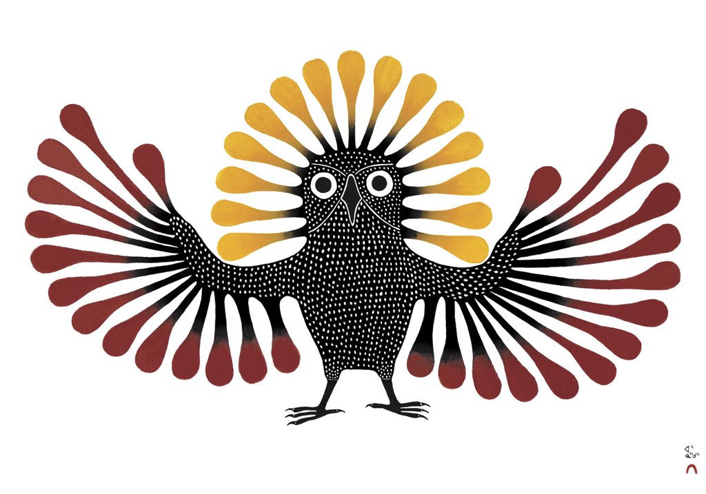
Preening Owl by Kenojuak Ashevak 1995
While I had studied Inuit art and I had seen a lot of work in galleries and museums, I had never met an Inuit artist. Several years ago, the Froelick Gallery hosted one of Cape Dorset’s artists, Saimaiyu Akesuk. I welcomed the rare opportunity to hear a contemporary Inuit artist share the origin and challenges of her artistic process and the details of a very different culture. While Akesuk no longer has to dog sled to the studio, it appears that that she and Kenojuak share a similar visual dialog steeped in their culture.
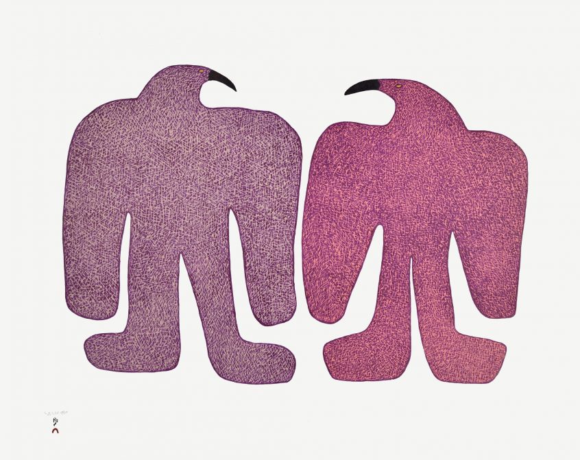
Counting Birds by Samaiyu Akesuk 2015
****** For those of you interested in following contemporary Inuit artists, Dorset Fine Arts, the wholesale marketing division of the West Baffin Eskimo Co-operative, has an Instagram presence: @dorsetfinearts
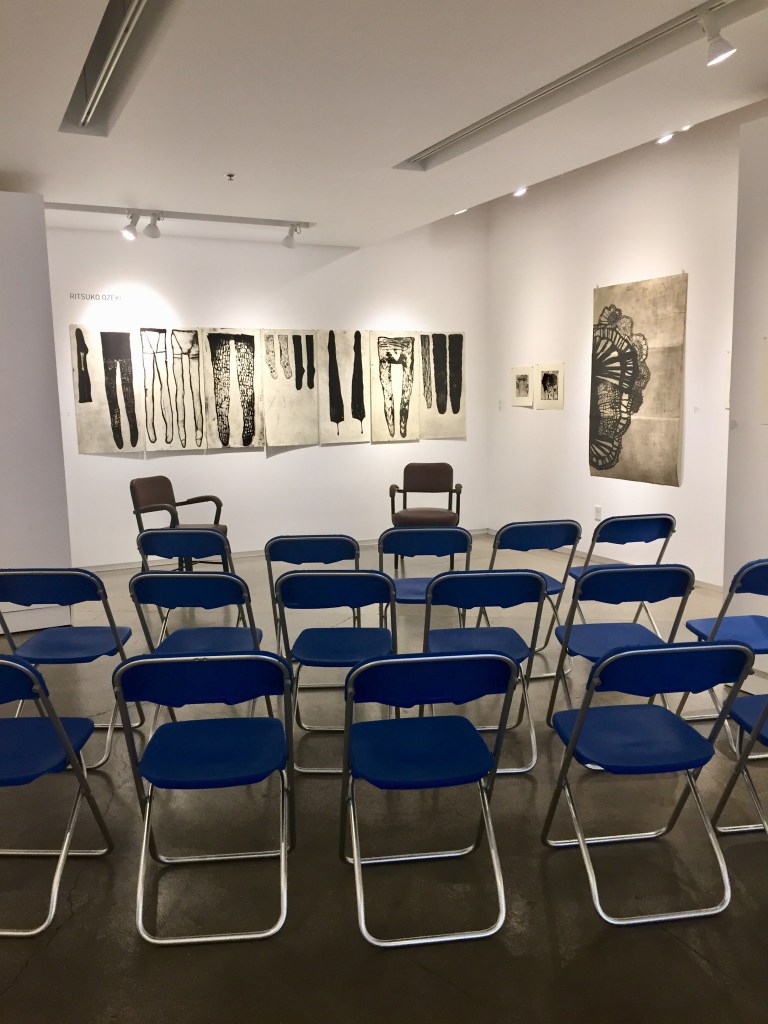
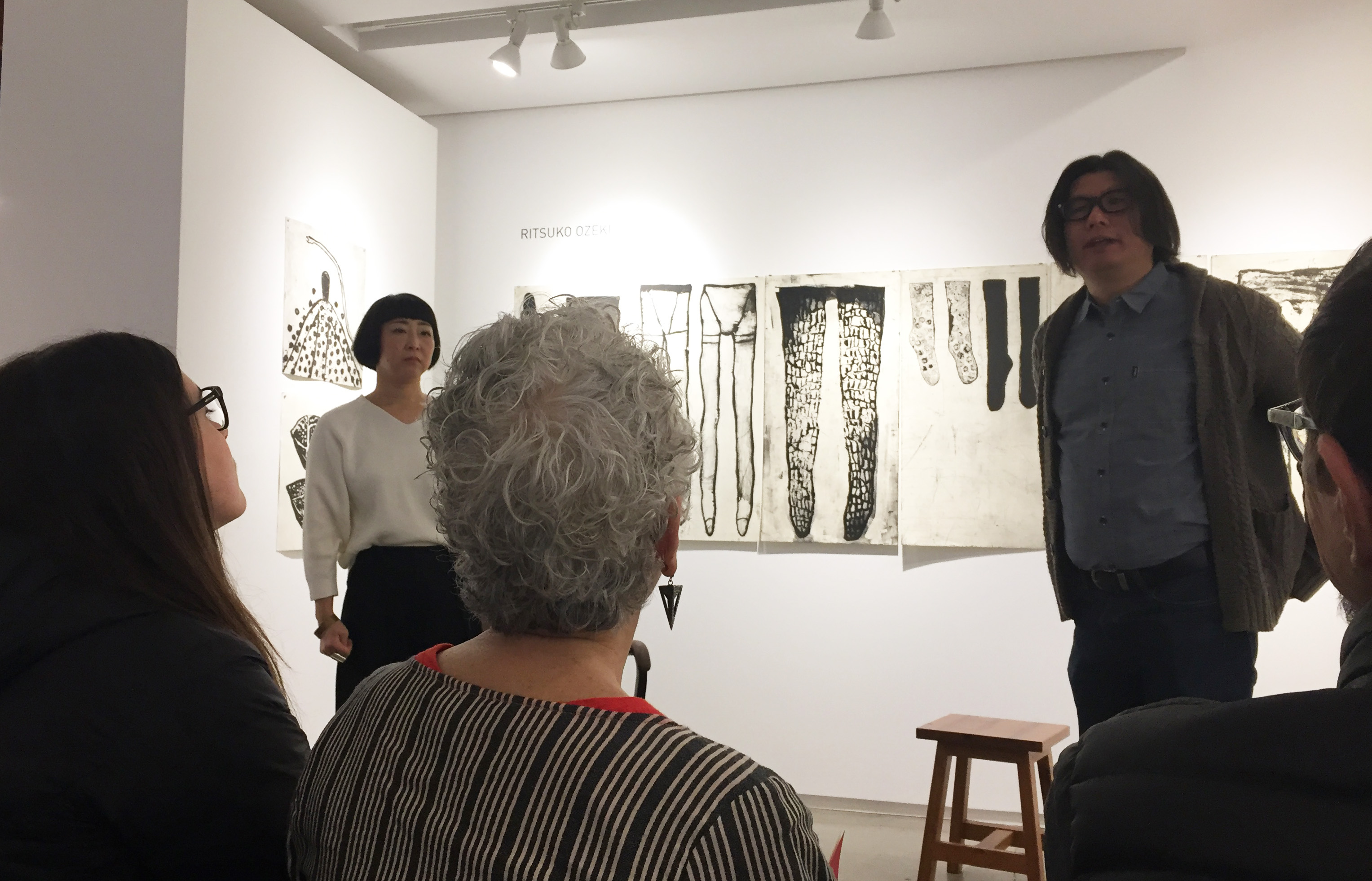
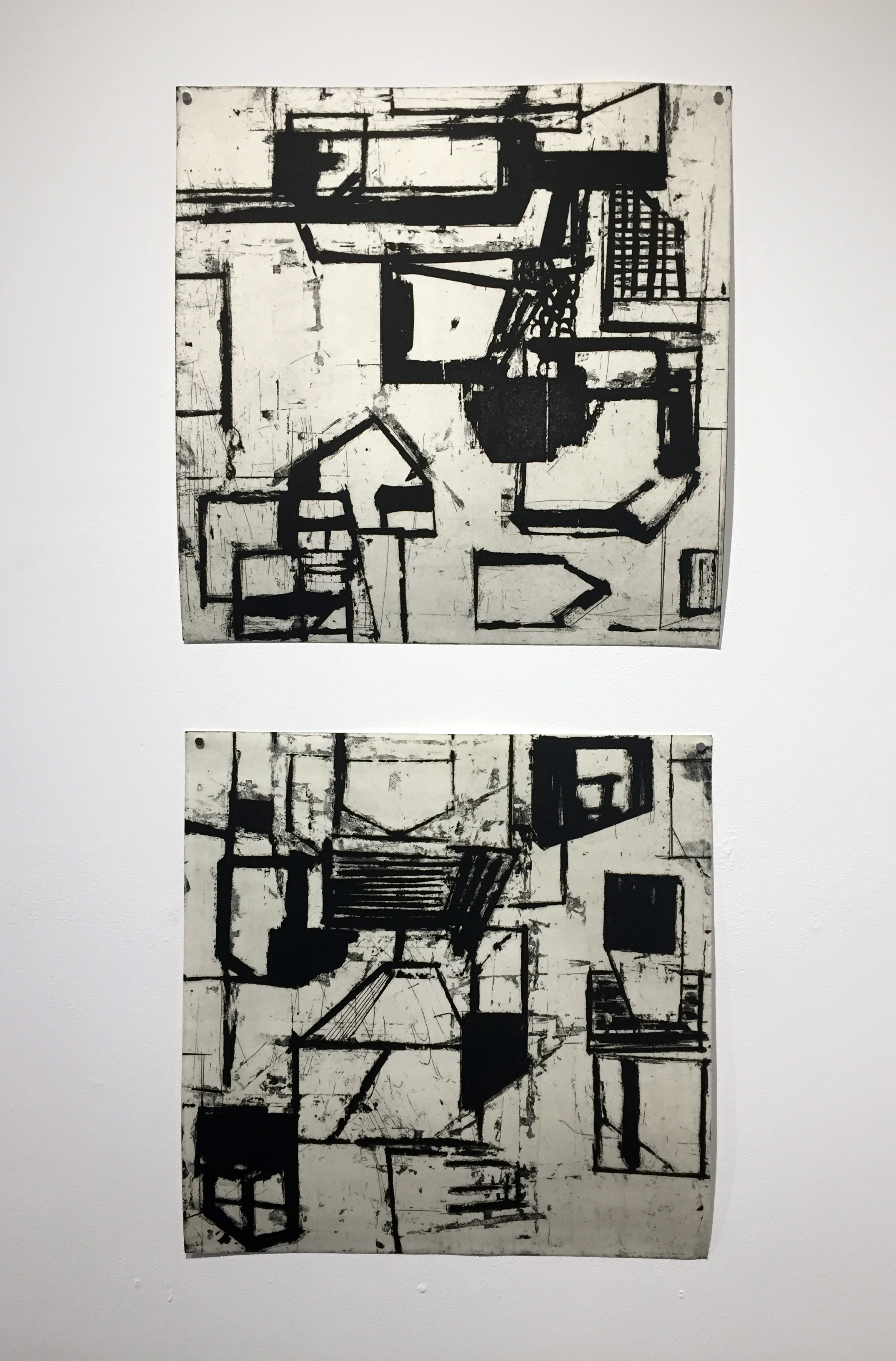
Last month I attended Ruth Ozeki’s artist talk on the occasion of her 20 year retrospective at the Froelick Gallery. It was a rare opportunity to listen to a Japanese printmaker share insights into her prints and her methods. Yoshihiro Kitai served as interpreter for Ms Ozeki and I scribbled down some quick notes. Most of the photos were taken with my phone and do not fully represent the quality of Ozeki’s prints. (I have noted one photo from the Froelick Gallery site.) I have tried to stay true to the translation of Ms Ozeki’s words about her life and her work.
Ritsuko Ozeki and Yoshihiro Kitai (and audience)
Ozeki describes herself as a quick printmaker. She studied calligraphy and it is an influence in her work. She makes her marks quickly and fluidly like a calligrapher. All of her prints are made with black ink. When asked why she doesn’t use color, Ozeki responded that the techniques to print in color are too complicated; they remove her from the way she like to make her marks. When she wants to work in color she paints.
Ozeki sketches constantly. She always carries her sketchbook (which she calls her journal) with her. Drawing is her life diary from which she later chooses images of interest to transfer onto copper plates. She does not draw in order to print, she draws as a way of recording her life.
Generally speaking, Ozeki described the theme throughout her work as being of life and death. It is never figurative in content, allowing the viewer to import their own images and history onto the prints. She draws her content from every day life – stairs, vessels – into which she infuses her personal experience. (It is interesting to note that Ozeki embraces what she describes as the “accidental scratches” on the plate.)
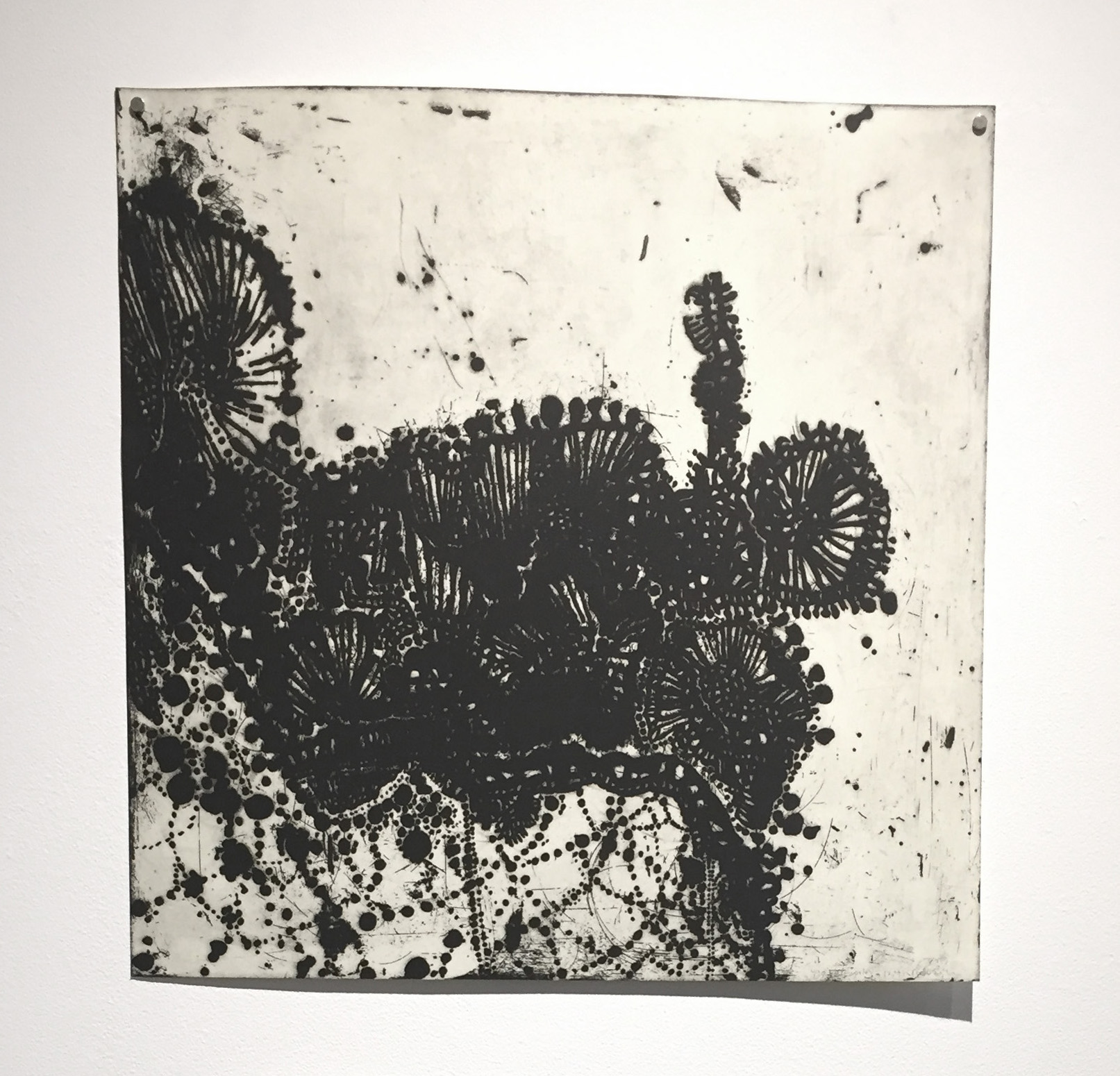
Lacework 2012 (lift ground etching, aquatint)
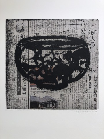
Ozeki started with an exploration of lace, then vessels including chine collé on newspaper. Lace and woven materials appear and re-appear. Her choice to use non archival materials is a considered one. She views the shift in color of newsprint as an indicator of daily life.
24 on the news 2009 (*from Froelick Gallery) (lift ground etching, aquatint chine colléº
The most significant evolution of Ozeki’s prints began after her mother’s passing away. Initially, Ozeki described her work as being more poetic; after her mother’s death the prints became more about feelings and magic.
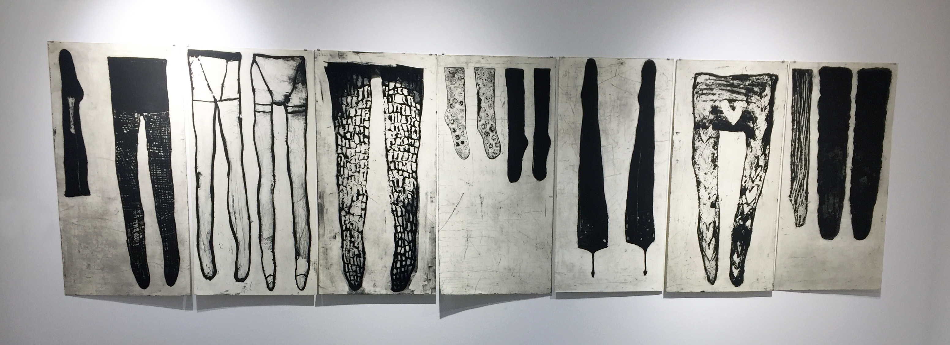
from the “Slough” series (many more available) (lift ground etching, aquatint)
Ozeki found a collection of stockings in her mother’s possessions after her death. The resulting “Slough” series is about the female’s life from baby clothing to the stockings. Vessels evolve from two hands joining to make a bowl to bring food, liquid to the mouth. Upon death, ashes are contained in an urn – another kind of vessel. The last vessel.
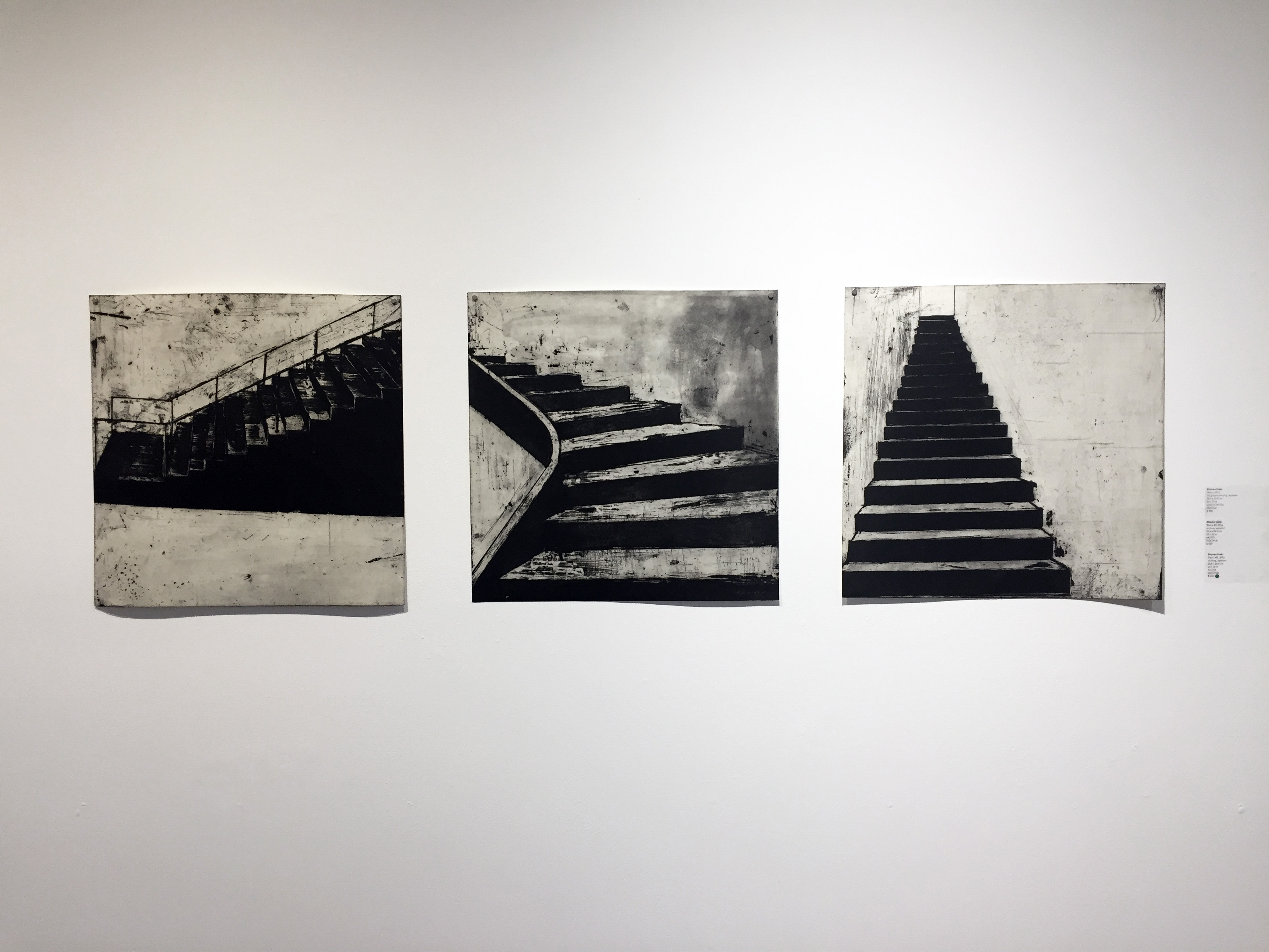
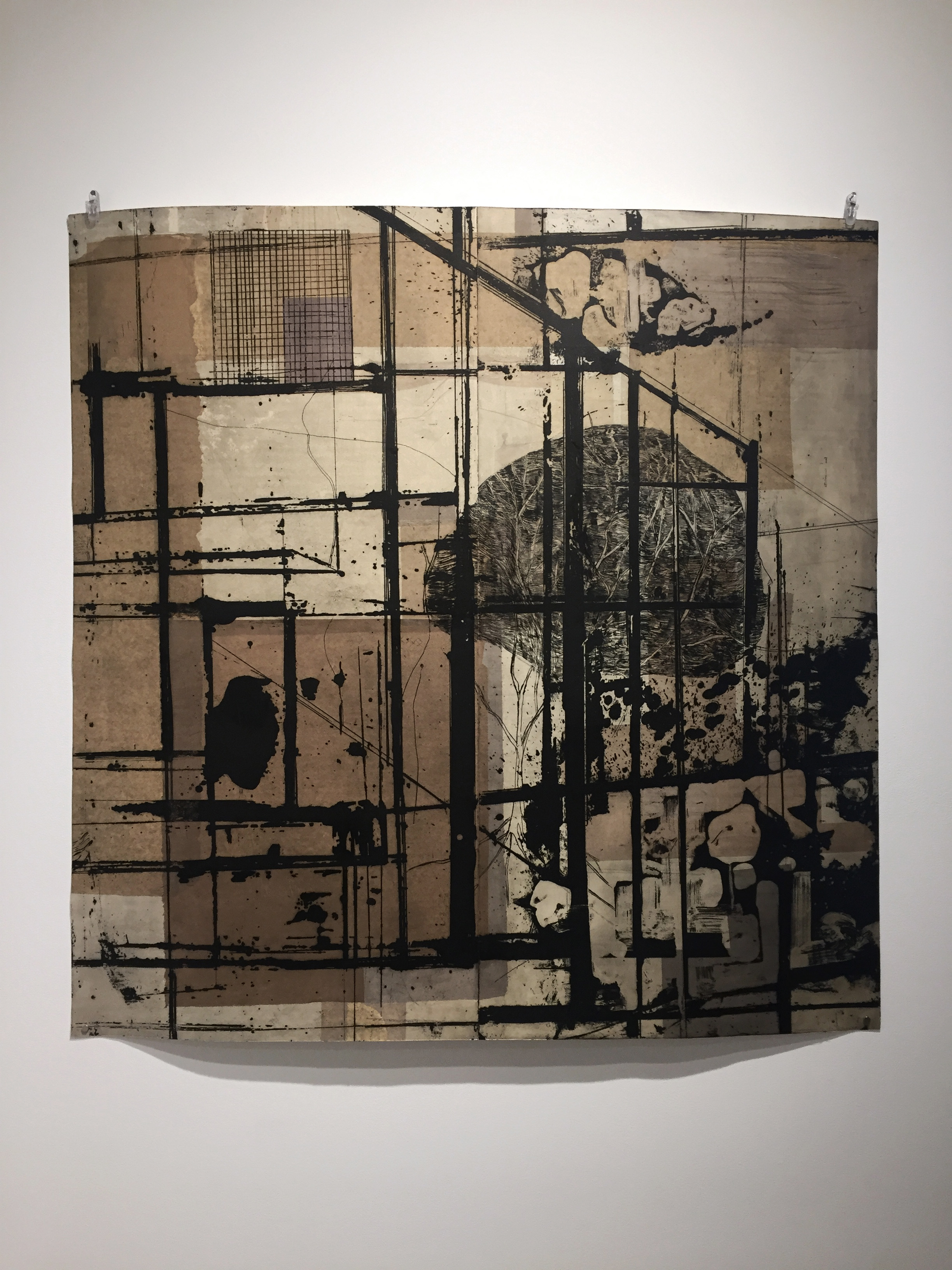
Not only has Ozeki experienced loss, she is also a survivor of the 2011 earthquake in Japan. Ozeki began to explore architectural forms, always mindful of the large loss of life. Stairs were often the only thing left standing. Not only do they represent structural stability but the transition from one place to another.
Ozeki has also experienced houses being tossed upside down and a chaos of structure. She developed house forms which she printed in every direction.
Town #2 2017, Town #1 2017 (etching, aquatint)
The exploration of architectural forms continues into the period of restoration. This print (below) was the most current of the exhibit and the largest at 39″ x 39″.
This print exhibit is one of the few that I have attended where none of the prints were framed. Being able to stand close to the work and follow the mark making was an intimate experience. The paper was allowed to buckle on the wall and cast shadows. As particular as I am about framing, I appreciated this more raw and trusting presentation of the work.
The talk was well attended by a mix of printmakers, artists in other media and collectors. Ms Ozeki was generous with her time and responses. When asked why she simply doesn’t draw what she wants to share, she responded that when she works on copper and pulls the paper back on the press, she feels the hand of God in her images. Most in attendance recognized that feeling. I learned some things about process but mostly this talk reinforced lessons I am already working on. I need to draw more = I can’t draw enough. I need to stay close to the subjects that touch my emotions deeply – being timid is not an option. Regardless of the difference in language and culture, the bones of creativity and sharing your work are universal. I spoke with Ms Ozeki after the talk – even without a lot of common words, I felt a strong sense of recognition.
Earlier this week I stumbled across the work of Mel McCuddin. Sometimes the most interesting discoveries are serendipitous. It gets better. Not only did I enjoy his paintings, I found a video that gives a glimpse into his process. Something about watching another person work makes me want to do the same. Watching Mr. McCuddin encouraged me to find more looseness and joy in my mark making.
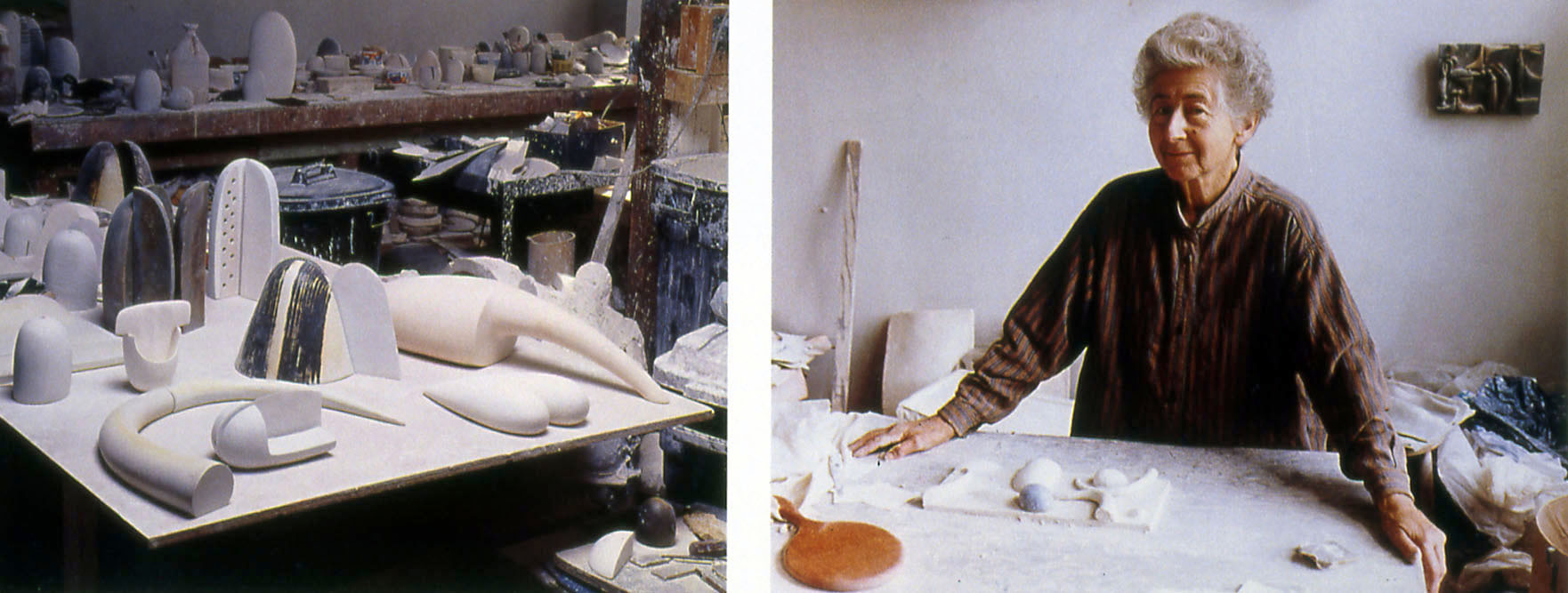
Sometimes I stumble across something that compels me to share. Recently, I was moved by the work and the words of Ruth Duckworth. excerpt from interview:
“Play is the essence of creativity. Creative play and gut reaction, instinct. When I work on a piece, I play. I have a whole huge section of the studio where I have an inventory of sculptural forms, simple, abstract, non-specific shapes that I find beautiful and enjoy making. Then I start building these shapes together. And when I find myself smiling, I say “hello!” I think I’ve got something. The process is intuitive, not intellectual. You have to learn to be spontaneous and trust yourself.”
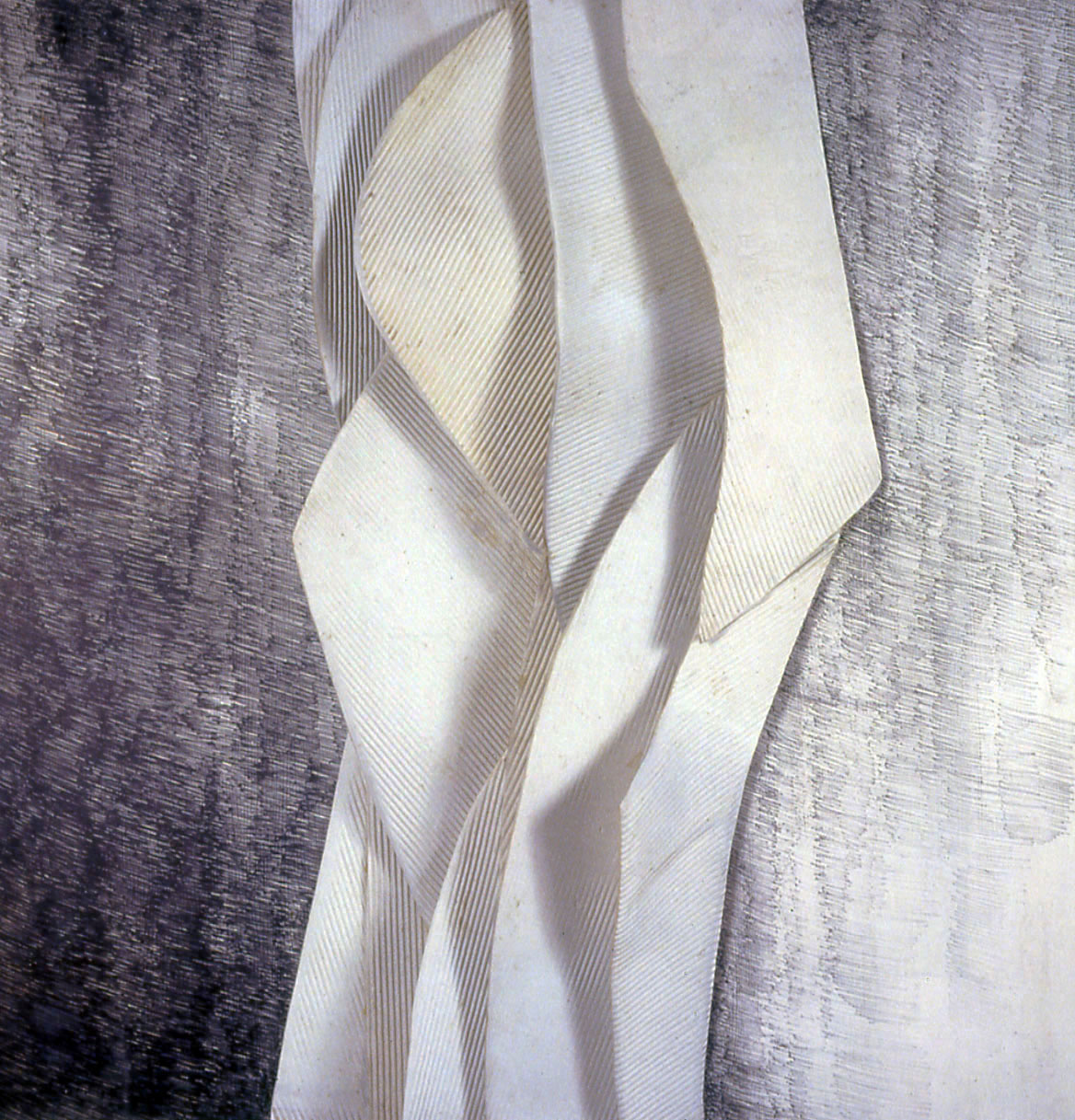
untitled (wall hanging)
porcelain with graphite drawing, 45 inches x 45 inches
“You’ve got to do what you’ve got to do, whether other people think it’s right or not,” she says. “If I want to do something that’s dubious, whether anybody else is going to love it, I’d still have to do it because I hope I’m going to love it. If I wanted to do a very big piece in here that looks like a mountain, but would probably never sell, I would do it.”
I was invited to participate in my first pop-up show last year. I wasn’t sure what to expect of the experience but I have to say that I liked it. There is a joyfulness and ease that results from the temporary nature of the show. Somehow, the pop-up avoids the gravitas, pomp and ceremony of some more traditional, month-long gallery shows. Yes, as an artist, the cost of preparing your work and the effort to get it to the gallery is the same. Yes, a lot of hard work is required to improve a space that has often been empty and unused for a long time. But – you get to see an empty storefront transformed: filled with art and people. I am happy to share that I have been invited to participate in another pop-up this month:
I came to printmaking through the back door of photography. I include Imogen Cunningham, Edward Weston and Ansel Adams as strong influences on my work. All three were members of Group f/64 whose photographs were characterized by maximum image sharpness of both foreground and distance. The group’s work celebrated the beauty inherent in landscapes, plants, found objects and the figure. F/64 also promoted the use of straight photographic techniques without special manipulation in the darkroom. I embrace many of these principles as an intaglio printmaker using traditional methods and tools.
As a student printmaker I was introduced to the work of Martin Lewis. Lewis’s prints are a celebration of light and texture. Using the most primary of printmaking methods (lots of drypoint), Lewis was able to express the delicacy of backlit textiles, detail within shadows and reflective surfaces. His ability to suggest facial features and emotion with a similar light touch both inspires and challenges me.
Studying the early prints of Jim Dine motivates me to be less reverent and restrained in my mark making. His work has an expressive, energetic looseness that remains an elusive goal for me. As I move forward in creating prints I aspire to combine the delicacy of Lewis, the energy of Dine and the technical honesty of Cunningham, Weston and Adams.
I would be remiss if I didn’t mention Gene Flores. It was his suggestion to try printmaking that started my education as an intaglio printmaker. It is his example of productivity and consistently high quality of work that challenges me to move forward and try harder.