Southbound and Down

Have you ever had a museum all to yourself? It’s one of those freak occurrences that rarely happens, like going to a movie theater by yourself, and then the movie starts and you realize that no one else ever came in. Honestly, unless you’ve worked in a museum, it probably rarely happens.

In the spirit of dipping my toes back into the outer world, into things I once enjoyed before the mere presence of people (no matter how benign) was enough to be processed as a threat to my existence, I took a trip down to Salem, OR to visit the Hallie Ford Museum, the excuse being to check out the first phase of a two-part exhibition of prints from the Crow’s Shadow Retreat in eastern Oregon. I’d visited the Hallie Ford at least a couple of times before, and even the most crowded I’d ever seen it wouldn’t have qualified as even a slow day at the PAM or MoPOP (which is also no measure of the value and quality of the Hallie Ford), but there’s a considerable difference between a few other patrons and zero other patrons.
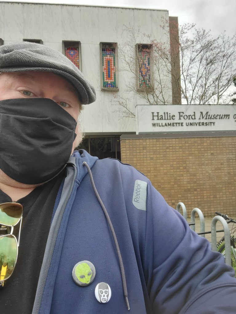
I walked up to the front desk, and told the woman that I had purchased a ticket for 2 PM.

She replied, “You must be Clayton!”

As she said that, I noticed another man who was wrapping up his visit, and that was the last non-employee I saw in the building during my time there. This was part of the appeal of the trip – during the last year, my only art viewing consisted of visiting a gallery in Portland that a couple of friends had a show up in last fall. Right before things really changed, I’d visited another gallery to see some enormous woodcut prints, and I remember doing that elbow bump thing we did for about three weeks with the artist before chatting with him for a while. So the steps the Hallie Ford is currently taking (I’m sure they’re on their website), combined with it not being jammed up with people made it an ideal location for me to put some art in my eyeballs.

I went knowing that the reason I was there – the prints in their Print Room – wasn’t really likely to be my cup of tea. That’s saying nothing about the quality of the work, simply that I rarely connect in a meaningful way with work that’s nature-oriented, regardless of medium. So I wasn’t putting a ton of weight on that part of the museum, this was a trip out to see something, hopefully spark some ideas. I generally liked the prints, I suspect some of them would have resonated a bit more if I’d watched an artist talk, gotten a better feeling for where each of the artists were coming from. And there was the matter of while these were prints, honest-to-God fine art prints, my chief experience as a printmaker has been in making etchings, some woodcuts, but never screen-printing or lithography. So I also didn’t have a toehold in technique to really immerse myself in the prints.

The first part of the museum I checked was on the main floor, I can’t recall the exact name for it, but it was a selection of work from Pacific Northwest artists, in a variety of media. It was in the middle of this exhibit that I saw the first piece that really grabbed my atttention. This is “Blondie,” an oil painting by Arvie Smith.
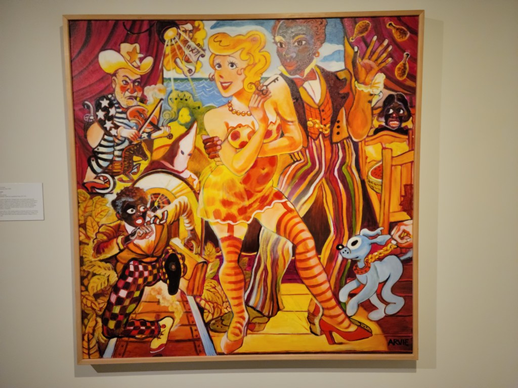
This is a lively, colorful painting that jumped off the wall in the midst of more mannered work. My real mental work started on this piece later, when I was preparing to post a pic of it on my Instagram stories (as I tend to do). The realization hit me, posting this piece in full is exactly the sort of thing that can get you suspended or banned from a platform. This is an aggressive, challenging piece of artwork that uses stereotypical imagery to make a point about that imagery itself. If a person who’s been targeted with this kind of imagery doesn’t have the right to address it, who does?

But on social media, online, none of that matters. Everything is binary, good or evil, racist or woke, ones or zeroes. There is no room for context, no time for deeper thought, and sure as hell no place for self-examination or admitting you were wrong about anything ever. You know, all the stuff that gives people a chance to be better at anything ever. The first reaction is all that matters, and that fellow in the bottom left, if posted on social media, would have been lightning rod for anyone who didn’t agree with me for any reason to run me off of that platform. I ended up posting a cropped version of the main figure on my stories, both neutering the artwork and making me question why on Earth I was participating in a platform that couldn’t deal with art that had anything meaningful to say.

In wandering through the building, there were some unexpected delights. There was an early Van Gogh painting (in Salem, OR!!!), a Diego Rivera painting, a Rodin sketch. The show of middle eastern coins was fascinating (the oldest being something like 1400 years old!). And then kitty corner from the Rivera painting was the other piece that really struck me. It’s called “Illegal Alien’s Guide to Somewhere Over the Rainbow,” a (very large) lithograph by Enrique Chagoya.
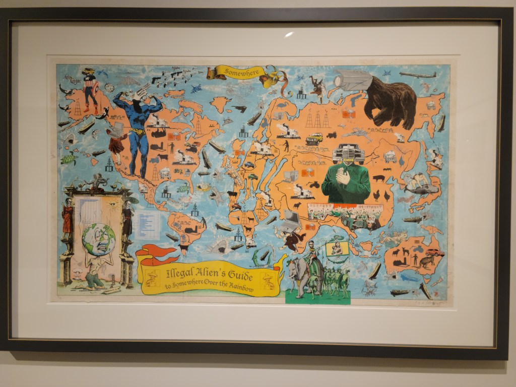
Similar to Arvie Smith’s piece, it’s colorful, energetic. There’s elements of found art incorporated throughout the piece, like little hidden jokes you stumble across, one after another. It speaks to optimism snarkily, a somewhat fatalistic look at the distance yet to be traveled, both literally for those seeking to find a new home, and metaphorically, in the distance between those people and acceptance from the people wherever they’re headed to. It plays with familiar imagery, and warps it for effect. It felt like an acknowledgment of the duality that people are having to flee to find a better life, but that maybe no best life exists. We all have work to do, distance left yet to travel.

I crossed paths with the lone security guard a couple of times, and talked to him for a couple of minutes before heading down to the lobby, where I talked with the woman at the front desk for a few minutes. All in all, I was there about an hour. I doubled back to look at those two aforementioned pieces a couple of times during that time, as well as getting another look at the Van Gogh. I’d paid for two hours of parking, but the last year has done a lot to erode my attention span, particularly away from home. Even with literally no one else around me for the vast bulk of my time, I reached the limit of my focus more quickly than I would have liked.

The second phase of the Crow’s Shadow Retreat prints opened this week (I believe), I hope to get back down there again in the next month or so to see the others, but also to spend some more time with some of those pieces that lodged themselves in my head on this trip.
Point of Entry

“You never get a second chance to make a first impression” – Jesus Christ, probably.

How do you unpack that sentence?  Let’s start off with a music video.

There are surely people who have fond memories of this song.  Also, I am equally sure that there are legions of Eagles fans who also followed Don Henley’s solo career with delight.  However, this song is my first memory of Henley (although I surely heard Eagles songs prior to this), a big hit that he had in 1989 that had considerable MTV play (which was a thing).  I was 13 years old, and this kind of morose nostalgia was literally the last thing on Earth I wanted to hear.  As a result of this song, to this very day I can’t stand Henley or the Eagles (and it feels good that the Dude will back me up on this one).  I had similar experiences with Eric Clapton (the Unplugged “Tears in Heaven”), and Jimmy Page (because of Coverdale/Page), but different ones with Robert Plant (“Tall Cool One”) and The Clash (Mick Jones’ Bad Audio Dynamite did “Rush,” a song I still love).  In every instance, it’s not so much what these people have done, but when.

I draw comic books.  My period of mass consumption of comics came largely in the 90s, the work that I read voraciously at that point was formative.  The artists that I revere, to some degree, had their peak work somewhere between the mid-80s and around 2000.  I have seen some of those artists’ reputations fall into disrepair or absolute ruin.  Their brilliant work is overshadowed in time by when people discover their work, which increasingly over time is not their peak work.

The MoPOP museum in Seattle had a fantastic exhibit up until earlier this year, built around a staggering amount of original artwork from the history of Marvel Comics.  I would not say that there were any must-see pieces, what I would consider covers or pages of unmistakable historical importance.  Jack Kirby’s work is the foundation of Marvel, and while there were a number of Kirby pages, they weren’t big boys.  They were Kirby pages, which was necessary, but the key ones weren’t present in any form.  What it did have was a breadth of work, including pages by creators who you don’t see work from exhibited very often.

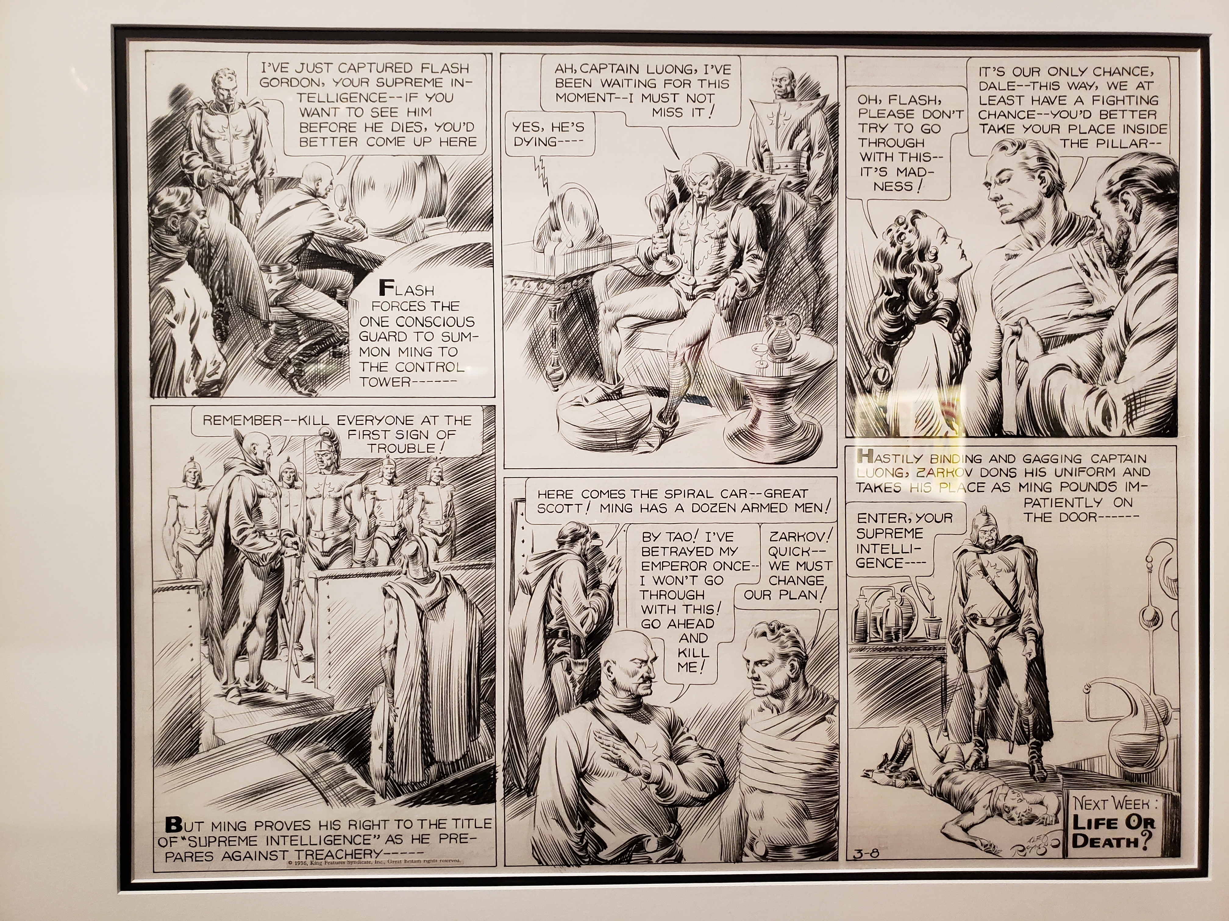
The very first page in the exhibit was a shock, an old Flash Gordon page by Alex Raymond.  Raymond is an artists’ artist, who died prematurely in a car accident.  He was also one of the most facile inkers in the history of inking, pages full of lush linework created entirely by brush (being good with a brush was considered the apex of cartooning in that era).  This page had nothing to do with Marvel Comics, it was there as an example of pre-Marvel Comics (if we were only so lucky for that kind of work to have been the norm), but I don’t need an excuse.  I had never seen Raymond’s artwork in person, and it was everything I had ever imagined it would be.

20181206_131538

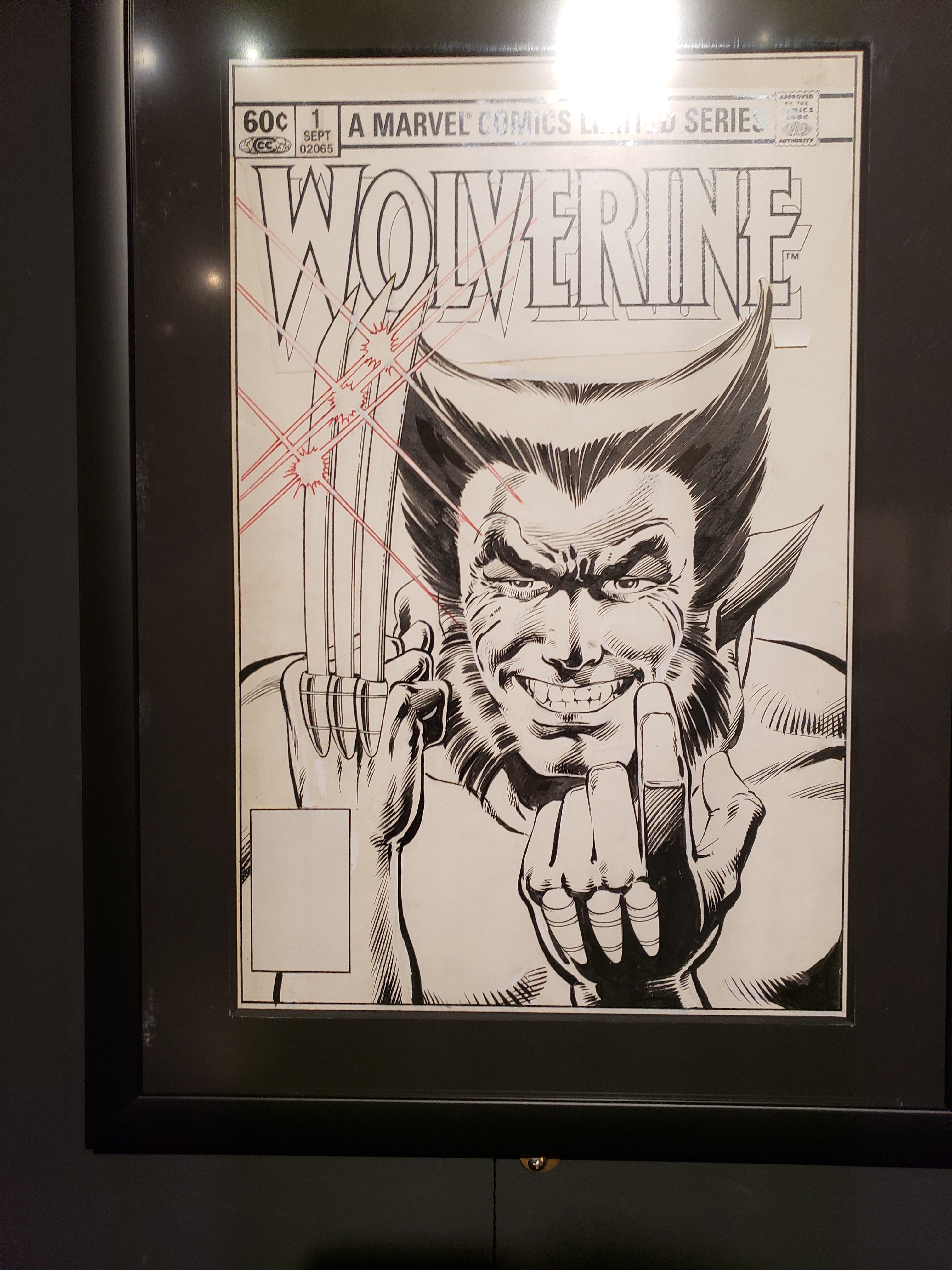
To the point of when you are introduced to someone being of supreme importance, we’ll look at the work of two artists represented in this show.  First is Frank Miller.  To me, having been introduced to his work in the early 90s, Miller is the guy who did “The Dark Knight Returns,” “Sin City,” “Daredevil,” and about a million other books that redefined how comics were created.

20181206_134053

Art by Frank Miller and Josef Rubenstein

In that era, Miller was a superstar, his work eagerly anticipated and read widely.  Arguably, you could probably track the end of that run to the release of the sequel of “Dark Knight,” in 2001.  It was a highly anticipated return to a character that Miller was synonymous with that wasn’t received particularly well at the time.  That was followed up with another eventually incomplete Batman project drawn by Jim Lee, the response to which was basically dismissal via proto-memes.

20181206_134431

Art by Frank Miller and Klaus Janson

But, understanding that at this point, many active comics readers have been introduced to Miller’s work not from the essential works that have been fully absorbed into the creative bloodstream (whether or not people are aware of it), but by late career equivalents of “The End of the Innocence,” it’s easy to see why people do not regard him in the manner that he once was.  The brilliance of Miller’s peak works haven’t dulled, but the prevailing first impression that many have had of his work is different.

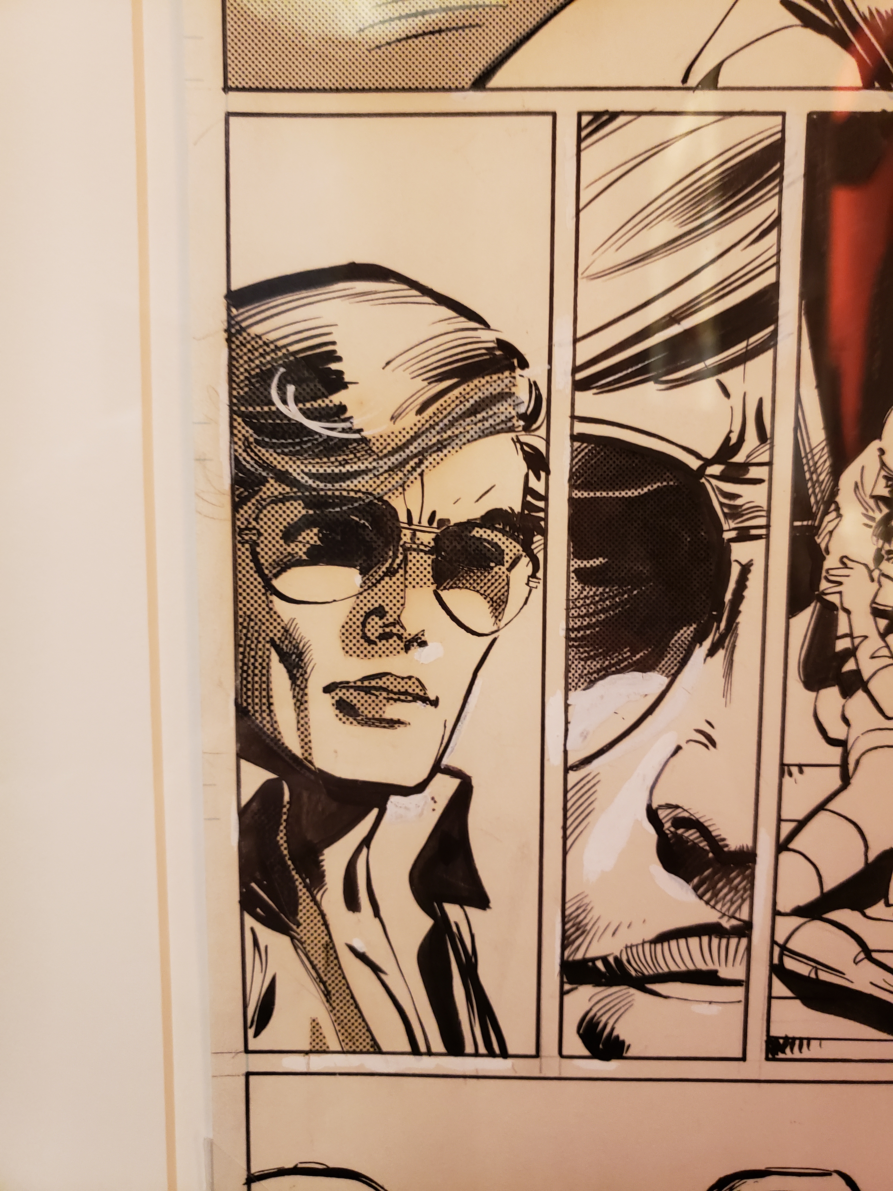
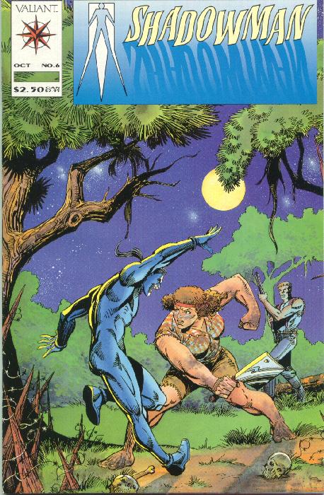
In reverse of that for me is the case of Steve Ditko.  He’s known for being the co-creator of Spider-Man (among others, but that’s the big one), for being into Ayn Rand and being an absolute recluse with little communication with anyone outside of the work that he continued to self-publish until his death last year.  He’s a Henley – I was introduced to his work as a teenager, in a form that didn’t make me curious to seek out more (he drew some issues for Valiant in the early 90s, inked oddly by other artists).  I was aware that his name carried weight, but I struggled to see why.  He engaged in no management of his catalog of work or massaging of his public image, both being absolutely irrelevant to him.  He lived to be 90 years old, before you scoff at that notion.

shadowman06

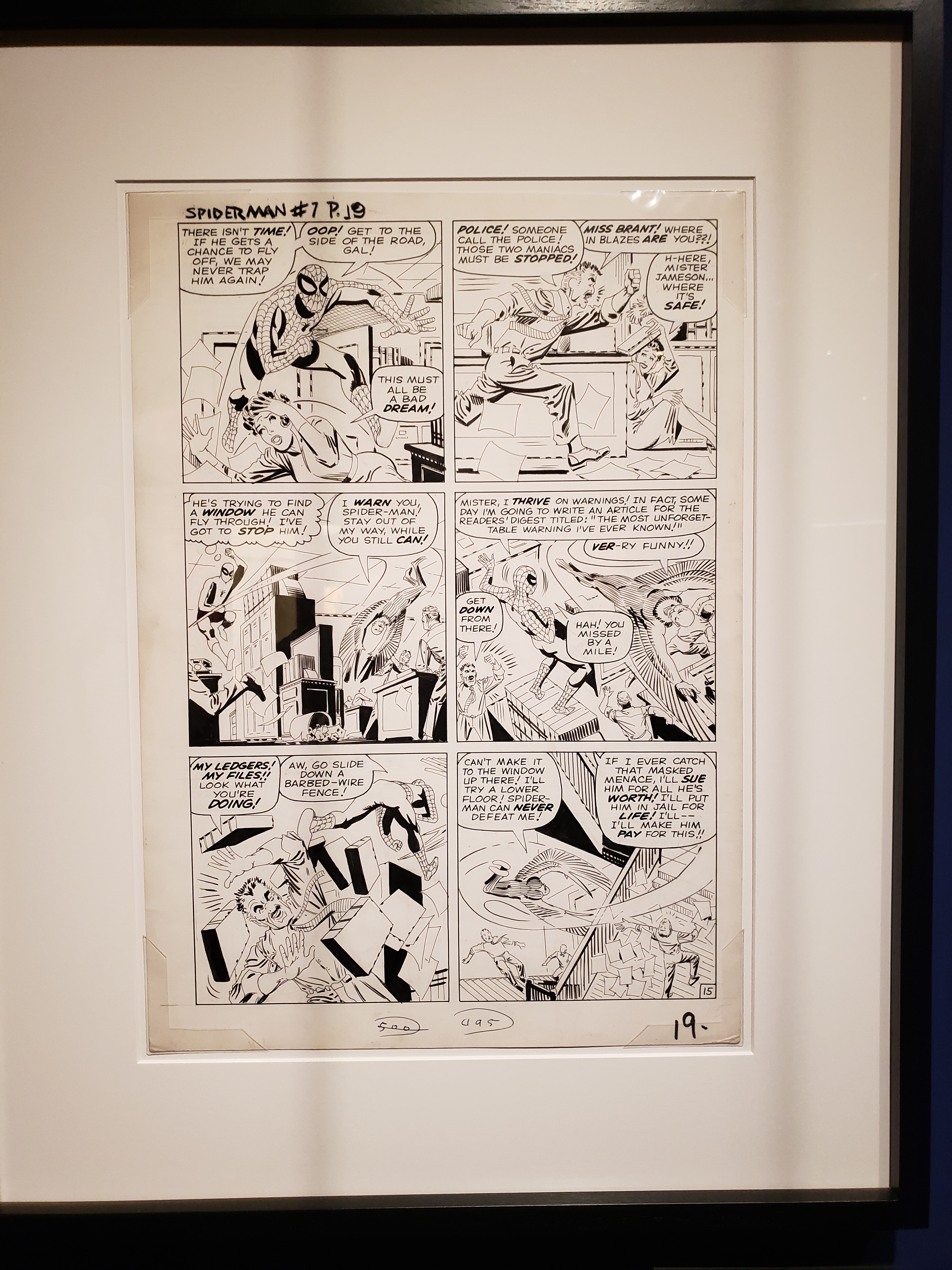
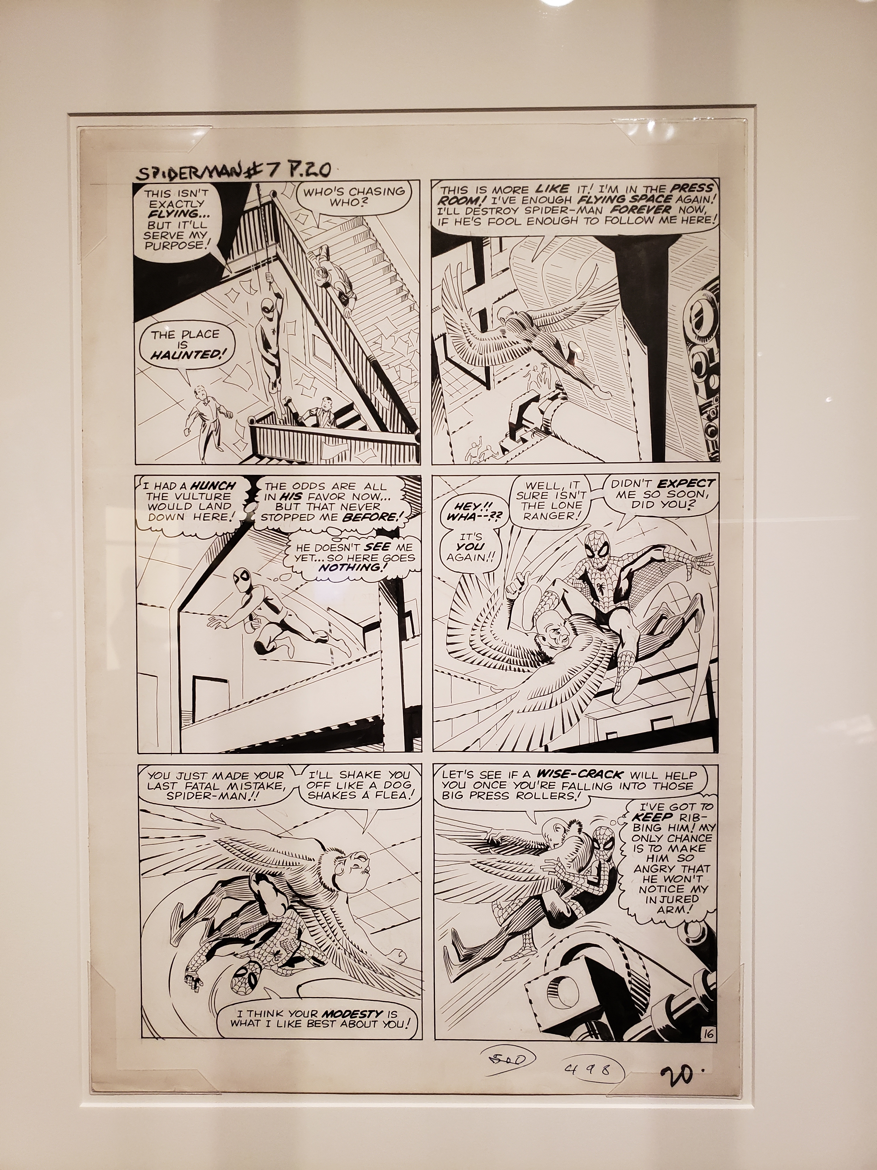
Prior to the MoPOP show, I had never seen a Ditko original before.  To me, the hallmarks of his work were flat linework, wonky and stiff poses, and a general awkwardness.  It was an appealing weirdness, particularly in his Dr. Strange work, but funky in a way that other artists were not.  So imagine my surprise when I saw these original pages (from Amazing Spider-Man #7), and discovered that his linework wasn’t flat at all.

ASM7p19

When you look at panel two, his influence on Frank Miller becomes apparent (look at J. Jonah Jameson’s pants), or on panel five, where he just blacks out sides of objects entirely.  Newsprint isn’t famous for retaining detail of fine linework, but after years of having seen cheap reprints of his Spider-Man stories that flattened out his tapered, carefully chosen lines and hid them under flat colors, this was a revelation.

ASM7p20

What I had, for years, interpreted as a lack of care in his inking, or a lack of flair, were revealed to be false impressions,  From seeing these two pages in their unadulterated form, Ditko went from a Henley to a Clapton, someone who I’ve gotten over a lame first impression to appreciate more fully.  If I had been around in the 1960s or 1970s, my opinion of Ditko would have been wildly different than having been introduced to his (not peak) work in the 1990s.  His Spider-Man pages are exactly the same as they ever were, but it took an open mind and the proper presentation for the power of his work to register.

c.

330 Years of Female Printmakers

Article Link

I’m sure (maybe not sure, but pretty sure in that “someone HAD to have done that, right?” way) that a woman somewhere had created a original print prior to 1570, but there is currently an exhibit at the New York Public Library examining the certainly under-heralded work of female printmakers from 1570-1900, which both sounds awesome and makes me rue the fact that my local public library has only a couple of quilts on permanent display to show their support for the arts.  Yay quilts, but I know at least one quilt maker whose work could probably improve the breadth and scope of my public library’s display.

Also, for those of us who are neither close to nor inclined to visit New York, there are downloadable images available, so you can load up your Kindle or whatever, balance it on a bottle of wine, and enjoy your own private art tour while approaching publicly inappropriate levels of intoxication.  Or not, because I’m not going to tell you how to live your life, aside from that you might want to click that link up there at the top of the article.  The rest is up to you.

c.


The Thrill of the Original

This past weekend, the 3rd Annual Portland Fine Print Fair took place, at the Portland Art Museum.  If you’ve never been to a print fair, basically art dealers bring their wares, set up a booth, and if you’ve got the money, honey…

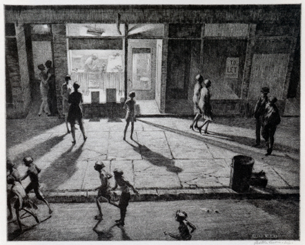
There are always a ridiculous amount of unbelievable prints by remarkable artists at things like this; last year had my jaw dropping at a number of Whistlers, this year was a booth that had ukiyo-e by artists like Hiroshige.  But another print caught my eye, one by Australian printmaker Martin Lewis, titled “Spring Night, Greenwich Village.”

sprint_night_greenwich_village

I apologize for the smallness of the image, there are bigger ones on the ‘net, but I didn’t want to step on toes.

In the era of the screen, one thing that people don’t seem to realize is that there is literally nothing like seeing the original piece of artwork.  Photography and pixels cannot accurately reproduce the subtleties of paintings and prints and pottery.  Yes, a jpeg is better than nothing, but when you’re limited by resolution and the size of your screen, you are always dealing with an imitation of the real deal.

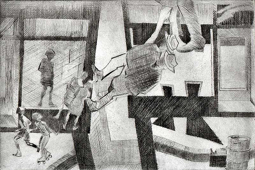
The reason that this really hit home (again) for me was that, in a printmaking class I took a few years back, one of the class assignments was to reinterpret this very Martin Lewis print.  We all had intimate familiarity with the image (or at least a reproduction of the image), and the techniques Lewis used to accomplish this beautiful print (mainly drypoint, for those wondering), so getting to see an actual impression made from the actual plate that Lewis worked on is like having the world suddenly snap into focus after years of being slightly hazy.

I ended up discussing the print with another patron at the fair, who was confused by Lewis’ use of sandground (which I am unfamiliar with, and suppose it’s a relative of softground and responsible for some of the texture on the sidewalk and street).  I also explained that the rich (so rich!), velvety blacks on the image were from drypoint, applied insistently.  We both marveled at the image for a minute or two after I had explained that this very print had been one of my student assignments.

It might seem that something like an intaglio etching, which is primarily produced in black and white (even that’s erroneous, as there are dozens of different shades of black ink, each distinguishable from one another), would survive reproduction without much loss of detail, but when you compare something that you know pretty well via reproduction to the original, the reintroduction to something you thought you knew (but with MORE) can be intense and delightful.

For comparison’s sake, here’s my version of this print, which I titled “Crossover.”

3364938366_12a114d63e_z

As it turns out, drypoint is a very difficult technique to master!

c.


Punching Up

In comedy, there’s a theory that a comedian should always be “punching up.”  In short, that means that comedy is funny when you’re taking on subjects that are higher in the hierarchy than you are, and that you risk coming off like a bully or worse when you make fun of those who are lower in the social hierarchy than you are.

I love reading David Apatoff’s “Illustration Art” blog for a lot of reasons – he’s got great taste, shines a light on amazing artists who aren’t necessarily in favor right now, and writes insightfully about illustration art.  So, take five minutes and read “An Artist’s Attic, part 3” right now.

Here’s what drives me insane about this article: Leonard Starr was a fabulous cartoonist, who’s particular skill at drawing facial expressions is deftly illustrated by the examples in that blog post.  Then, Apatoff tries to go the “the kids are all wrong” route by giving examples of more contemporary cartoonists’ work.  Unfortunately, it’s the work of cartoonists who’s work uniformly appears as if it was drawn with a pen clutched between one’s butt cheeks.  It’s not a throw-down between Starr and Kevin Maguire, who is known for his comedic mastery of facial expressions, and who has worked for the big two publishers consistently for something like 30 years now, which would have been a more fair fight.

There are great working young artists right now, and there are also ones who appear to draw only during seizures.  I wouldn’t have used any of those contemporary examples as examples of anything, other than of books I probably would leave on the bookshelf at the bookstore that I found it at.  This is what punching down looks like in art writing – taking someone’s unique, indisputable skill and juxtaposing it against people who barely qualify as visual artists.  You can make anyone and anything look badly through that technique, but it doesn’t really mean anything.

But also, feel free to take another five minutes to really go over those Leonard Starr faces, they are stunners.

c.

The Bite of the Print

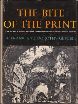
A couple of weeks ago, I picked up an old, musty book on printmaking entitled “The Bite of the Print,” by Frank and Dorothy Getlein.  I have a weakness for old books on printmaking, regardless of their individual merit (although, if nothing else, I usually find out about a couple of new artists that I need to research more fully), and will buy nearly anything on the subject that I come across.

TheBiteofthePrintThis particular book was published in 1963, and it’s particular point of view is to take a look at satire and irony in the history of printmaking.  It goes all the way back to Durer, and through Kathe Kollwitz, and hits all the major players along the way (like Hogarth, Daumier, Rembrandt, and more).  And, of course, the highlight of any of these books is the “new artists” section, which is populated by people like Lasansky and Emil Nolde, who were somewhat contemporary at the point of publication.

But the real reason to check out this book is that the writing is insightful and lively, with personal looks at the artists covered (I have a book about William Hogarth, one of my favorite artists, and the single chapter here does more to humanize him than the entire other book about him).  The best comparison that I can give is that, while I generally don’t like reading history books, I find Sarah Vowell’s books fascinating, partially because she’s an excellent writer with command of the material, but also because she’s able to make history into stories about real people, which is far more relateable than a litany of titles, dates, and places.

If you’ve got a similar weakness for printmaking books, this one’s super-cheap at Amazon, and I found it an unexpectedly worthwhile read.

c.

Hey, Artist, We Don’t Appreciate Your Kind Around These Parts

And by these parts, I mean North America.  Probably further than that, too.

Today I read two (well, let’s call it three) different articles basically illustrating a fundamental problem for any artist who wants to actually make artwork.  Here are the links, to fuel your depressive tendencies:

When Iggy Pop Can’t Live Off His Art, What Chance Do the Rest Have?

It’s All But Impossible To Earn A Living As A Working Artist, New Report Shows

How Comic Conventions Came To Have So Little Room For Comics (a reach, but relevant to me)

If you didn’t feel like reading all of that, the short version is that people don’t care about anything except what they care about, and even then they’re not going to spend money even on things they do like.  People just expect things to be there, and for free, preferably optimized for their screens.  I mean, if you pay $600 for an iPad, anything you can jam on there should be free of charge, right?  People even find ways to be offended about getting something presumably of value for free.

There’s no good, simple answer to any of this.  The eternal question of art, at least from one’s parents, is “how do you expect to make a living at this?”  There are a lot of reasons to make art, to pursue it in a serious, determined manner, but few of them are “practical” ones, and it’s unlikely that one’s work will find a hospitable environment to exist in.  Even the notion of making enough money to fund future work (and not even at any kind of profit) can seem like a far-off, unreachable goal.

Then again, maybe it’s just a slow news day today, and these sites have nothing better than try to passive-aggressively pile discouragement on people who are just trying to find something interesting and meaningful to say to the people around them.  Thanks for the pep talk, guys!

c.

Art in the Pearl 2014

IMAG1038

Art in the Pearl is the biggest Portland-area art fair, and justifiably so.  This year’s layout was smaller than in previous years, but the quality of the artists exhibiting was high.  There’s not a lot to say about Art in the Pearl, other than that the work is good, it’s well-attended, well-organized, and the weather was nice.  I had the opportunity to talk to a couple of artists, which is always a good thing, including one of the presenters from the ZAPP Art Festival Conference that I had attended earlier in the week.

Part of the fun of these shows is seeing work different than your own, part is getting to talk to the people responsible for interesting work first-hand.  Plus, getting a gyro and a couple of bites of Ben & Jerry’s for lunch isn’t too bad, either.

c.

ArtBurst NorthWest 2014

ArtBurst NW


ArtBurst Northwest is an art fair in West Linn, OR, formerly known as the West Linn Arts Festival.  I had exhibited at the show in its previous incarnation, but it’s been a couple of years, so I wanted to drop in and see how/if things had changed.

There were a couple of artists whose work I liked (which shouldn’t be interpreted as a slam on anyone involved with the show – if you put together any 100 artists, it’s so unlikely that more than a fraction’s work would be to my personal tastes), but if I had to sum up the show in one word, I’d go with “decorative.”  Lots of flowers, birds, landscapes, etc, some of which is executed with great skill.  I’ve never been on the inside of a jurying process, so I don’t know if that’s just the type of artist who chooses to submit to this particular show, or if it’s by design.  Either way, it jibes with my perception of the earlier incarnation of ArtBurst, that you won’t find much figurative work there, or anything challenging.  

But if you were looking for something in that vein, Marylhurst is a beautiful campus (it made me miss the days of being devoted to one pursuit in a place that supports that), and the show is well-run.  There was even a shuttle running between distant parking lots and the show itself, which is a welcome touch, and it wasn’t overcrowded, like Art in the Pearl can frequently feel.

Influences

I grew up in a smallish town, where things like art weren’t readily available.  It wasn’t an unusual suburban experience; I played baseball and basketball like a lot of kids, I went to see movies when I could.  I still remember an audience I was part of giving a standing ovation to the end of “The Karate Kid.”  Just a random screening some weekend, and all of us loved the ending so much we all stood up and applauded at the screen, with no one involved with the making of the movie within a thousand miles of the theater.

But things like movies seemed like they were undoable.  There wasn’t really the idea of authorship of a film; the credits, even for a basic, uncomplicated movie, still comprised an army of experts all working towards the same goal.  TV shows were the same way, records…  No matter how much I loved a given record, there was still scores of names involved in the making.  Everything from musicians to producers to songwriters to lawyers and agents…  Books were the one thing that someone could make, but not just anyone could make a book.  It probably took me until middle school before I read a novel by an author that was actually alive, and there weren’t many Maya Angelou’s wandering around in my life, that I could ask about how she sat down and wrote “I Know Why the Caged Bird Sings.”

Eventually, my friends started collecting baseball cards, and then comic books, and then I started actually reading comic books.  I became aware that they were made by actual people, people who had differing levels of skill, and I figured that I could perhaps master one of those skills and be one of those guys involved in making comic books.  That seemed like an attainable goal.  Most comic books were made by four or five people; a writer, one or two people doing the artwork, someone who made all of the word balloons readable and neat, and someone who colored in the artwork.  On top of that, there was an editor who oversaw the whole process.  That’s just how things were done – assembly line production.

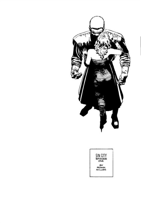
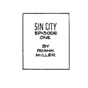
When I was 15 years old, Dark Horse Comics (from nearby Milwaukie, OR) published the first installment of a story called “Sin City.”  This is what the first page looks like:

Image


It’s a beautiful drawing, in a style rarely used in comics at the time.  But that’s not what caught my eye.  This was:

Image

By Frank Miller.

Well, who wrote it?  Who lettered it?

By Frank Miller.

You mean he did everything?  That’s not possible, where are the rest of the credits?  There are no more credits.  This was the first time that I’d seen an entire comic book from one hand before.  The pinnacle of cartooning was no longer mastering one skill, it was mastering ALL the skills.  This small box expanded the parameters of what I figured was possible.  At that point, “By Clayton Hollifield” became my new mission.

Film director Robert Rodriguez (“Spy Kids,” “Desperado”) put it a little more elegantly in his book, “Rebel Without a Crew,” which I’d stumble across in college.  He’s talking about film, but this is some serious life advice:

“…there are extreme benefits to being able to walk into this business and be completely self-sufficient.  It scares people.  Be scary.”

Frank Miller’s “Sin City” is how a kid got introduced to the idea of art, where there was no art anywhere, as far as the eye could see.  The idea that you could create anything you wanted, without compromise, so long as you had the skills to make it a reality was a pretty damned attractive one.

 -clay