“You never get a second chance to make a first impression” – Jesus Christ, probably.
How do you unpack that sentence? Let’s start off with a music video.
There are surely people who have fond memories of this song. Also, I am equally sure that there are legions of Eagles fans who also followed Don Henley’s solo career with delight. However, this song is my first memory of Henley (although I surely heard Eagles songs prior to this), a big hit that he had in 1989 that had considerable MTV play (which was a thing). I was 13 years old, and this kind of morose nostalgia was literally the last thing on Earth I wanted to hear. As a result of this song, to this very day I can’t stand Henley or the Eagles (and it feels good that the Dude will back me up on this one). I had similar experiences with Eric Clapton (the Unplugged “Tears in Heaven”), and Jimmy Page (because of Coverdale/Page), but different ones with Robert Plant (“Tall Cool One”) and The Clash (Mick Jones’ Bad Audio Dynamite did “Rush,” a song I still love). In every instance, it’s not so much what these people have done, but when.
I draw comic books. My period of mass consumption of comics came largely in the 90s, the work that I read voraciously at that point was formative. The artists that I revere, to some degree, had their peak work somewhere between the mid-80s and around 2000. I have seen some of those artists’ reputations fall into disrepair or absolute ruin. Their brilliant work is overshadowed in time by when people discover their work, which increasingly over time is not their peak work.
The MoPOP museum in Seattle had a fantastic exhibit up until earlier this year, built around a staggering amount of original artwork from the history of Marvel Comics. I would not say that there were any must-see pieces, what I would consider covers or pages of unmistakable historical importance. Jack Kirby’s work is the foundation of Marvel, and while there were a number of Kirby pages, they weren’t big boys. They were Kirby pages, which was necessary, but the key ones weren’t present in any form. What it did have was a breadth of work, including pages by creators who you don’t see work from exhibited very often.
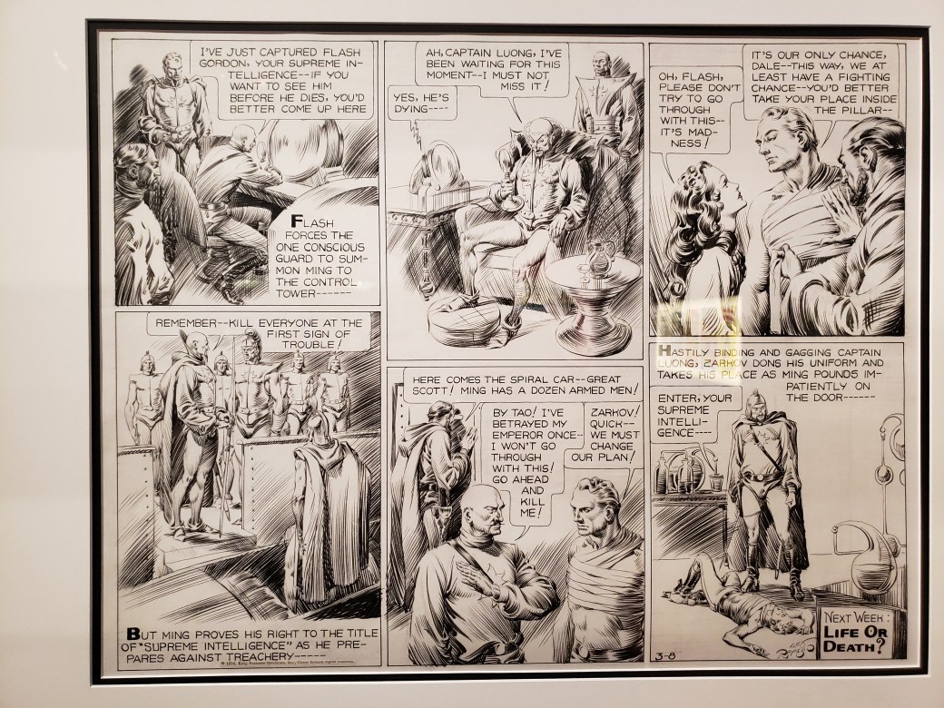
The very first page in the exhibit was a shock, an old Flash Gordon page by Alex Raymond. Raymond is an artists’ artist, who died prematurely in a car accident. He was also one of the most facile inkers in the history of inking, pages full of lush linework created entirely by brush (being good with a brush was considered the apex of cartooning in that era). This page had nothing to do with Marvel Comics, it was there as an example of pre-Marvel Comics (if we were only so lucky for that kind of work to have been the norm), but I don’t need an excuse. I had never seen Raymond’s artwork in person, and it was everything I had ever imagined it would be.
To the point of when you are introduced to someone being of supreme importance, we’ll look at the work of two artists represented in this show. First is Frank Miller. To me, having been introduced to his work in the early 90s, Miller is the guy who did “The Dark Knight Returns,” “Sin City,” “Daredevil,” and about a million other books that redefined how comics were created.
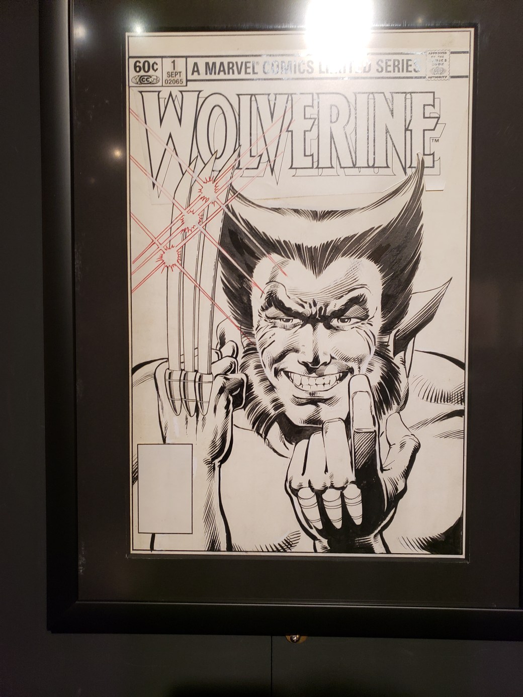
Art by Frank Miller and Josef Rubenstein
In that era, Miller was a superstar, his work eagerly anticipated and read widely. Arguably, you could probably track the end of that run to the release of the sequel of “Dark Knight,” in 2001. It was a highly anticipated return to a character that Miller was synonymous with that wasn’t received particularly well at the time. That was followed up with another eventually incomplete Batman project drawn by Jim Lee, the response to which was basically dismissal via proto-memes.
Art by Frank Miller and Klaus Janson
But, understanding that at this point, many active comics readers have been introduced to Miller’s work not from the essential works that have been fully absorbed into the creative bloodstream (whether or not people are aware of it), but by late career equivalents of “The End of the Innocence,” it’s easy to see why people do not regard him in the manner that he once was. The brilliance of Miller’s peak works haven’t dulled, but the prevailing first impression that many have had of his work is different.
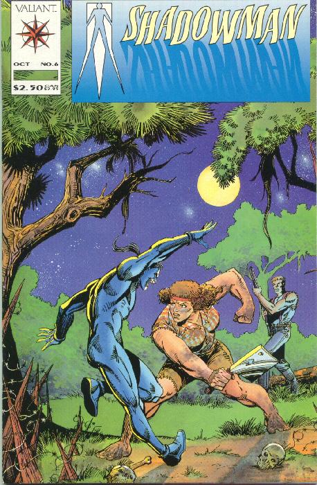
In reverse of that for me is the case of Steve Ditko. He’s known for being the co-creator of Spider-Man (among others, but that’s the big one), for being into Ayn Rand and being an absolute recluse with little communication with anyone outside of the work that he continued to self-publish until his death last year. He’s a Henley – I was introduced to his work as a teenager, in a form that didn’t make me curious to seek out more (he drew some issues for Valiant in the early 90s, inked oddly by other artists). I was aware that his name carried weight, but I struggled to see why. He engaged in no management of his catalog of work or massaging of his public image, both being absolutely irrelevant to him. He lived to be 90 years old, before you scoff at that notion.
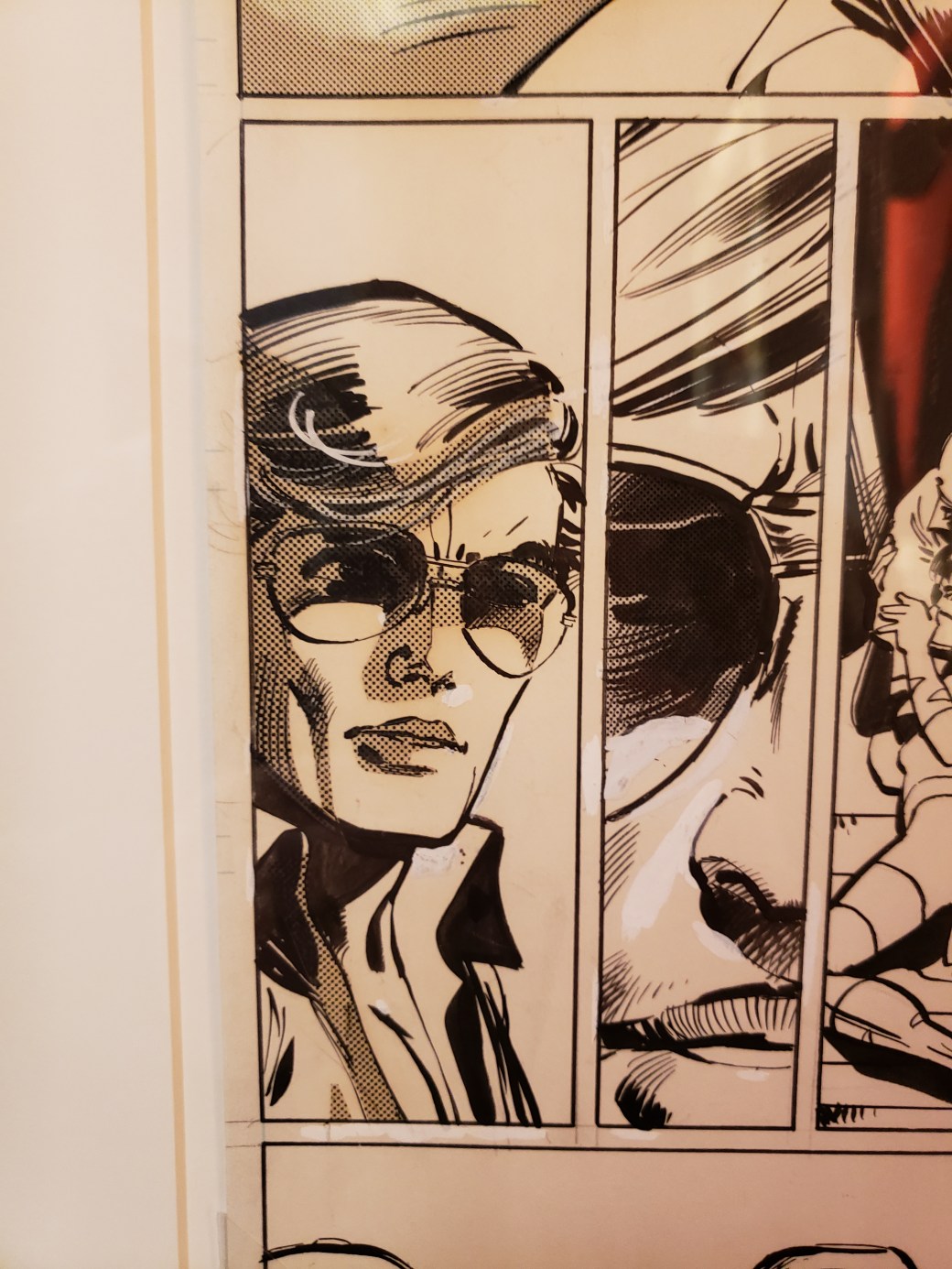
Prior to the MoPOP show, I had never seen a Ditko original before. To me, the hallmarks of his work were flat linework, wonky and stiff poses, and a general awkwardness. It was an appealing weirdness, particularly in his Dr. Strange work, but funky in a way that other artists were not. So imagine my surprise when I saw these original pages (from Amazing Spider-Man #7), and discovered that his linework wasn’t flat at all.
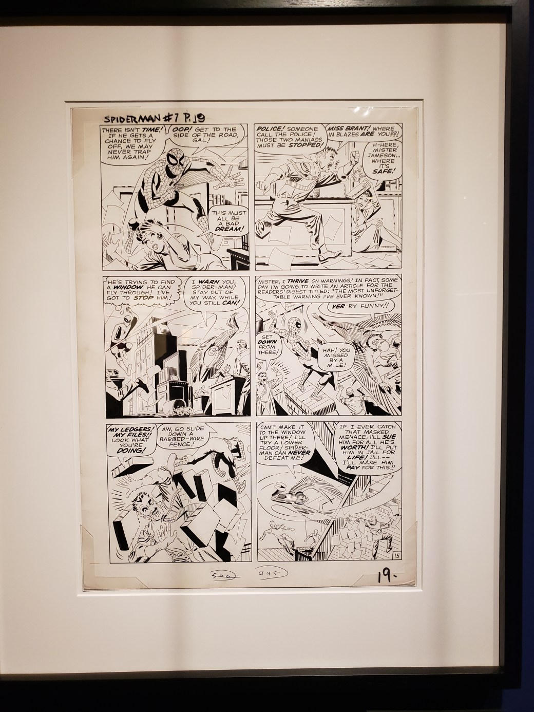
When you look at panel two, his influence on Frank Miller becomes apparent (look at J. Jonah Jameson’s pants), or on panel five, where he just blacks out sides of objects entirely. Newsprint isn’t famous for retaining detail of fine linework, but after years of having seen cheap reprints of his Spider-Man stories that flattened out his tapered, carefully chosen lines and hid them under flat colors, this was a revelation.
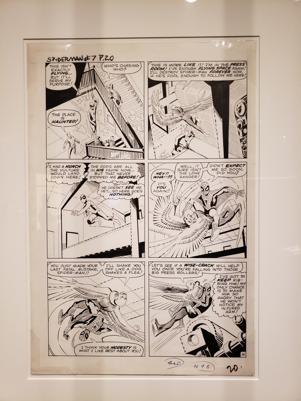
What I had, for years, interpreted as a lack of care in his inking, or a lack of flair, were revealed to be false impressions, From seeing these two pages in their unadulterated form, Ditko went from a Henley to a Clapton, someone who I’ve gotten over a lame first impression to appreciate more fully. If I had been around in the 1960s or 1970s, my opinion of Ditko would have been wildly different than having been introduced to his (not peak) work in the 1990s. His Spider-Man pages are exactly the same as they ever were, but it took an open mind and the proper presentation for the power of his work to register.
c.
