insight and inspiration: Ruth Duckworth

Sometimes I stumble across something that compels me to share. Recently, I was moved by the work and the words of Ruth Duckworth. R Duckworth at play 
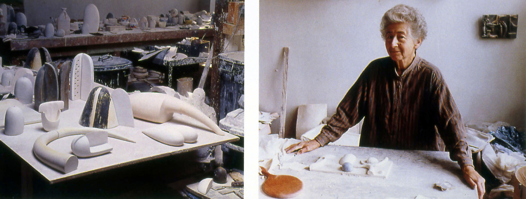
excerpt from interview:

“Play is the essence of creativity. Creative play and gut reaction, instinct. When I work on a piece, I play. I have a whole huge section of the studio where I have an inventory of sculptural forms, simple, abstract, non-specific shapes that I find beautiful and enjoy making. Then I start building these shapes together. And when I find myself smiling, I say “hello!” I think I’ve got something. The process is intuitive, not intellectual. You have to learn to be spontaneous and trust yourself.” R Duckworth

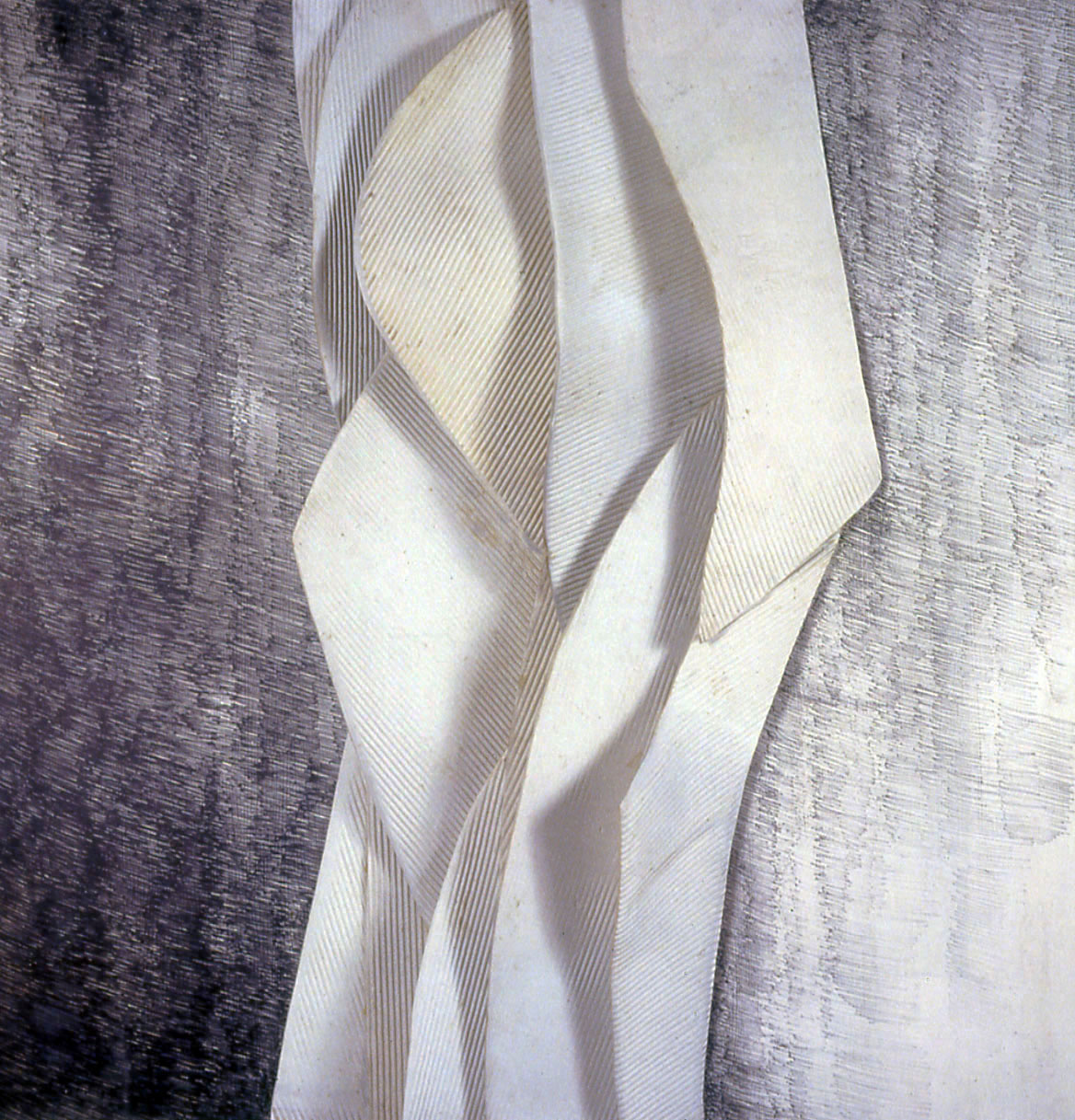
untitled (wall hanging)

porcelain with graphite drawing, 45 inches x 45 inches

“You’ve got to do what you’ve got to do, whether other people think it’s right or not,” she says. “If I want to do something that’s dubious, whether anybody else is going to love it, I’d still have to do it because I hope I’m going to love it. If I wanted to do a very big piece in here that looks like a mountain, but would probably never sell, I would do it.”

Pop-up shows: have you ever been in one?

I was invited to participate in my first pop-up show last year. I wasn’t sure what to expect of the experience but I have to say that I liked it. There is a joyfulness and ease that results from the temporary nature of the show. Somehow, the pop-up avoids the gravitas, pomp and ceremony of some more traditional, month-long gallery shows. Yes, as an artist, the cost of preparing your work and the effort to get it to the gallery is the same. Yes, a lot of hard work is required to improve a space that has often been empty and unused for a long time. But – you get to see an empty storefront transformed: filled with art and people. I am happy to share that I have been invited to participate in another pop-up this month: small file of Blink poster

The Bite of the Print

A couple of weeks ago, I picked up an old, musty book on printmaking entitled “The Bite of the Print,” by Frank and Dorothy Getlein.  I have a weakness for old books on printmaking, regardless of their individual merit (although, if nothing else, I usually find out about a couple of new artists that I need to research more fully), and will buy nearly anything on the subject that I come across.

TheBiteofthePrintThis particular book was published in 1963, and it’s particular point of view is to take a look at satire and irony in the history of printmaking.  It goes all the way back to Durer, and through Kathe Kollwitz, and hits all the major players along the way (like Hogarth, Daumier, Rembrandt, and more).  And, of course, the highlight of any of these books is the “new artists” section, which is populated by people like Lasansky and Emil Nolde, who were somewhat contemporary at the point of publication.

But the real reason to check out this book is that the writing is insightful and lively, with personal looks at the artists covered (I have a book about William Hogarth, one of my favorite artists, and the single chapter here does more to humanize him than the entire other book about him).  The best comparison that I can give is that, while I generally don’t like reading history books, I find Sarah Vowell’s books fascinating, partially because she’s an excellent writer with command of the material, but also because she’s able to make history into stories about real people, which is far more relateable than a litany of titles, dates, and places.

If you’ve got a similar weakness for printmaking books, this one’s super-cheap at Amazon, and I found it an unexpectedly worthwhile read.

c.

Standing in Awe – an epiphany

A few weeks ago, I went to the Museum of Fine Arts in Boston, where I saw an excellent show of Goya’s work.  However, the awe came as I went to the Contemporary Art collection.  In a large atrium/gallery I found this hanging from the ceiling (and my roommate from college, whom I was visiting, took a picture for me):

photo-1

I thought it was pretty cool.  As you know, I love cells and curvilinear forms in nature, and this was speaking my visual vocabulary.  However, when I found out what it was made of, I fell in love.  Styrofoam cups (Untitled, 2003, approx. 16 feet x 16 feet).  So, I looked up the artist when I returned home, and there I discovered the work of Tara Donovan, an American artist that makes large installation pieces from everyday manufactured materials:  straight pins, straws, tar paper, film……  I had seen an example of her work a few years earlier at the ICA in Boston, a large cube comprised of straight pins, but this work really made me take notice.  It achieves such a presence, it transforms the material used to make it, it speaks my visual vocabulary, and it told me that I was not yet making the art that I want to make.  So, back to the drawing board.

Hey, Artist, We Don’t Appreciate Your Kind Around These Parts

And by these parts, I mean North America.  Probably further than that, too.

Today I read two (well, let’s call it three) different articles basically illustrating a fundamental problem for any artist who wants to actually make artwork.  Here are the links, to fuel your depressive tendencies:

When Iggy Pop Can’t Live Off His Art, What Chance Do the Rest Have?

It’s All But Impossible To Earn A Living As A Working Artist, New Report Shows

How Comic Conventions Came To Have So Little Room For Comics (a reach, but relevant to me)

If you didn’t feel like reading all of that, the short version is that people don’t care about anything except what they care about, and even then they’re not going to spend money even on things they do like.  People just expect things to be there, and for free, preferably optimized for their screens.  I mean, if you pay $600 for an iPad, anything you can jam on there should be free of charge, right?  People even find ways to be offended about getting something presumably of value for free.

There’s no good, simple answer to any of this.  The eternal question of art, at least from one’s parents, is “how do you expect to make a living at this?”  There are a lot of reasons to make art, to pursue it in a serious, determined manner, but few of them are “practical” ones, and it’s unlikely that one’s work will find a hospitable environment to exist in.  Even the notion of making enough money to fund future work (and not even at any kind of profit) can seem like a far-off, unreachable goal.

Then again, maybe it’s just a slow news day today, and these sites have nothing better than try to passive-aggressively pile discouragement on people who are just trying to find something interesting and meaningful to say to the people around them.  Thanks for the pep talk, guys!

c.

An Influence

In 1985, my brother-in-law John gave me a copy of “Rhapsody” for Christmas. This beautiful book is a catalog of Jennifer Bartlett’s seminal work of the same name. The piece, comprised of hundreds of 12” x 12” painted metal tiles, was originally exhibited at the Paula Cooper Gallery in New York in 1976 and then again 30 years later, at the Museum of Modern Art.

BartlettRhapsody

1985 was coincidentally, the year I finished my graduate program in painting. When I received the book, I was chagrinned to realize that despite 3 intensive years of study, I had never come across her work. This was due no doubt, to my sloppy and somewhat random research skills. But, I also hold my professors responsible for thoroughly examining the work of her contemporaries, artists like Jim Dine, Robert Rauschenberg and Alex Katz, while failing even the slightest mention of someone referred to as “one of the most successful artists in the 1970s” by Klaus Ottmann, a curator at the Phillips Collection in Washington DC.

After I saw the images in “Rhapsody”, Bartlett immediately became and continues to be a major influence for me. I strongly relate to her inclination to combine many small elements to achieve a coherent whole. Additionally, her iconic “child-like” house motif as well as her garden images touch on the theme of domesticity – something I value deeply as content. In the late 1980s, while in New York, I saw drawings and painting from the garden series and found the work to be unforgettably luscious and painterly. She has been working for the better part of 50 years and a Google image search yields, I think,  a remarkably diverse and rich cross-section of what she has accomplished.

tumblr_m0l3uuCign1r6lkk1o1_1280

Art in the Pearl 2014

IMAG1038

Art in the Pearl is the biggest Portland-area art fair, and justifiably so.  This year’s layout was smaller than in previous years, but the quality of the artists exhibiting was high.  There’s not a lot to say about Art in the Pearl, other than that the work is good, it’s well-attended, well-organized, and the weather was nice.  I had the opportunity to talk to a couple of artists, which is always a good thing, including one of the presenters from the ZAPP Art Festival Conference that I had attended earlier in the week.

Part of the fun of these shows is seeing work different than your own, part is getting to talk to the people responsible for interesting work first-hand.  Plus, getting a gyro and a couple of bites of Ben & Jerry’s for lunch isn’t too bad, either.

c.

Art as Therapy and so Much More

I recently listened to a segment from one of my favorite podcasts, “To The Best of Our Knowledge” (Wisconsin Public Radio), and was touched to hear Alain de Botton’s beautifully articulated ideas on the topic of looking at art. http://www.ttbook.org/book/art-therapy-alain-de-botton

Even though the word “therapy” is in the title, his thinking about how we might relate to art is anything but clinical. I’ve seldom heard a more passionate or succinct description of the relationship between artist, art and viewer.

                                         E. Manet   Asparagus

Édouard Manet (French, 1832-1883). Bunch of Asparagus, 1880. Oil on canvas. 46 x 55 cm (18 1/16 x 21 5/8 in.). Wallraf-Richartz-Museum & Fondation Corboud, Köln


ArtBurst NorthWest 2014

ArtBurst NW


ArtBurst Northwest is an art fair in West Linn, OR, formerly known as the West Linn Arts Festival.  I had exhibited at the show in its previous incarnation, but it’s been a couple of years, so I wanted to drop in and see how/if things had changed.

There were a couple of artists whose work I liked (which shouldn’t be interpreted as a slam on anyone involved with the show – if you put together any 100 artists, it’s so unlikely that more than a fraction’s work would be to my personal tastes), but if I had to sum up the show in one word, I’d go with “decorative.”  Lots of flowers, birds, landscapes, etc, some of which is executed with great skill.  I’ve never been on the inside of a jurying process, so I don’t know if that’s just the type of artist who chooses to submit to this particular show, or if it’s by design.  Either way, it jibes with my perception of the earlier incarnation of ArtBurst, that you won’t find much figurative work there, or anything challenging.  

But if you were looking for something in that vein, Marylhurst is a beautiful campus (it made me miss the days of being devoted to one pursuit in a place that supports that), and the show is well-run.  There was even a shuttle running between distant parking lots and the show itself, which is a welcome touch, and it wasn’t overcrowded, like Art in the Pearl can frequently feel.

Go Gomuban!

My preferred etching substrate is copper, but I was willing give Gomuban relief printing plates a go (thanks, Deb!).  The challenge was to design an image featuring water creatures.  I found that the plate was soft and easy to carve.  After applying burnt umber Akua ink, I used a baren to pull the prints by hand.  If my imaginary fish looks friendly, my work here is done.

fishie-plateFishie