Polyester litho plates are inexpensive and easy to work with. The process can result in lines which mimic crayon or pencil and can be printed on either a litho or etching press. These 2 videos do a good job of explaining the processes of creating and printing plates.
“The trick is to do what you love and to be content alone in the studio. And if you that, you have everything you need.” Thomas Nozkowski, Painter
The images are getting richer and more intense. Some are even leaning into story-telling. Responding to an active canvas is certainly different than facing a blank one! Although we each work alone in a studio, our collaborators’ spirits join us on the page as we apply color and line with brush, pencil, pen. Here are our artists’ responses:
“You never get a second chance to make a first impression” – Jesus Christ, probably.
How do you unpack that sentence? Let’s start off with a music video.
There are surely people who have fond memories of this song. Also, I am equally sure that there are legions of Eagles fans who also followed Don Henley’s solo career with delight. However, this song is my first memory of Henley (although I surely heard Eagles songs prior to this), a big hit that he had in 1989 that had considerable MTV play (which was a thing). I was 13 years old, and this kind of morose nostalgia was literally the last thing on Earth I wanted to hear. As a result of this song, to this very day I can’t stand Henley or the Eagles (and it feels good that the Dude will back me up on this one). I had similar experiences with Eric Clapton (the Unplugged “Tears in Heaven”), and Jimmy Page (because of Coverdale/Page), but different ones with Robert Plant (“Tall Cool One”) and The Clash (Mick Jones’ Bad Audio Dynamite did “Rush,” a song I still love). In every instance, it’s not so much what these people have done, but when.
I draw comic books. My period of mass consumption of comics came largely in the 90s, the work that I read voraciously at that point was formative. The artists that I revere, to some degree, had their peak work somewhere between the mid-80s and around 2000. I have seen some of those artists’ reputations fall into disrepair or absolute ruin. Their brilliant work is overshadowed in time by when people discover their work, which increasingly over time is not their peak work.
The MoPOP museum in Seattle had a fantastic exhibit up until earlier this year, built around a staggering amount of original artwork from the history of Marvel Comics. I would not say that there were any must-see pieces, what I would consider covers or pages of unmistakable historical importance. Jack Kirby’s work is the foundation of Marvel, and while there were a number of Kirby pages, they weren’t big boys. They were Kirby pages, which was necessary, but the key ones weren’t present in any form. What it did have was a breadth of work, including pages by creators who you don’t see work from exhibited very often.
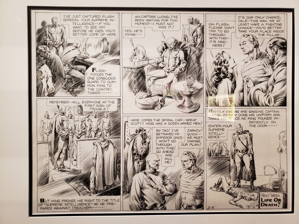
The very first page in the exhibit was a shock, an old Flash Gordon page by Alex Raymond. Raymond is an artists’ artist, who died prematurely in a car accident. He was also one of the most facile inkers in the history of inking, pages full of lush linework created entirely by brush (being good with a brush was considered the apex of cartooning in that era). This page had nothing to do with Marvel Comics, it was there as an example of pre-Marvel Comics (if we were only so lucky for that kind of work to have been the norm), but I don’t need an excuse. I had never seen Raymond’s artwork in person, and it was everything I had ever imagined it would be.
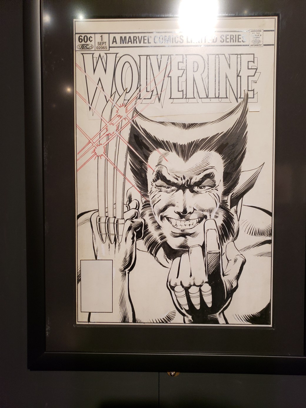
To the point of when you are introduced to someone being of supreme importance, we’ll look at the work of two artists represented in this show. First is Frank Miller. To me, having been introduced to his work in the early 90s, Miller is the guy who did “The Dark Knight Returns,” “Sin City,” “Daredevil,” and about a million other books that redefined how comics were created.
Art by Frank Miller and Josef Rubenstein
In that era, Miller was a superstar, his work eagerly anticipated and read widely. Arguably, you could probably track the end of that run to the release of the sequel of “Dark Knight,” in 2001. It was a highly anticipated return to a character that Miller was synonymous with that wasn’t received particularly well at the time. That was followed up with another eventually incomplete Batman project drawn by Jim Lee, the response to which was basically dismissal via proto-memes.
Art by Frank Miller and Klaus Janson
But, understanding that at this point, many active comics readers have been introduced to Miller’s work not from the essential works that have been fully absorbed into the creative bloodstream (whether or not people are aware of it), but by late career equivalents of “The End of the Innocence,” it’s easy to see why people do not regard him in the manner that he once was. The brilliance of Miller’s peak works haven’t dulled, but the prevailing first impression that many have had of his work is different.
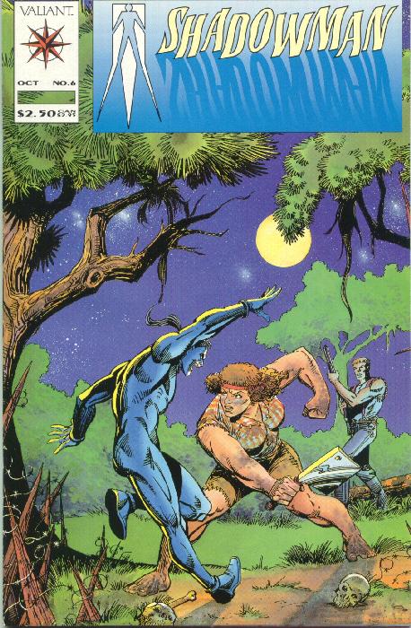
In reverse of that for me is the case of Steve Ditko. He’s known for being the co-creator of Spider-Man (among others, but that’s the big one), for being into Ayn Rand and being an absolute recluse with little communication with anyone outside of the work that he continued to self-publish until his death last year. He’s a Henley – I was introduced to his work as a teenager, in a form that didn’t make me curious to seek out more (he drew some issues for Valiant in the early 90s, inked oddly by other artists). I was aware that his name carried weight, but I struggled to see why. He engaged in no management of his catalog of work or massaging of his public image, both being absolutely irrelevant to him. He lived to be 90 years old, before you scoff at that notion.
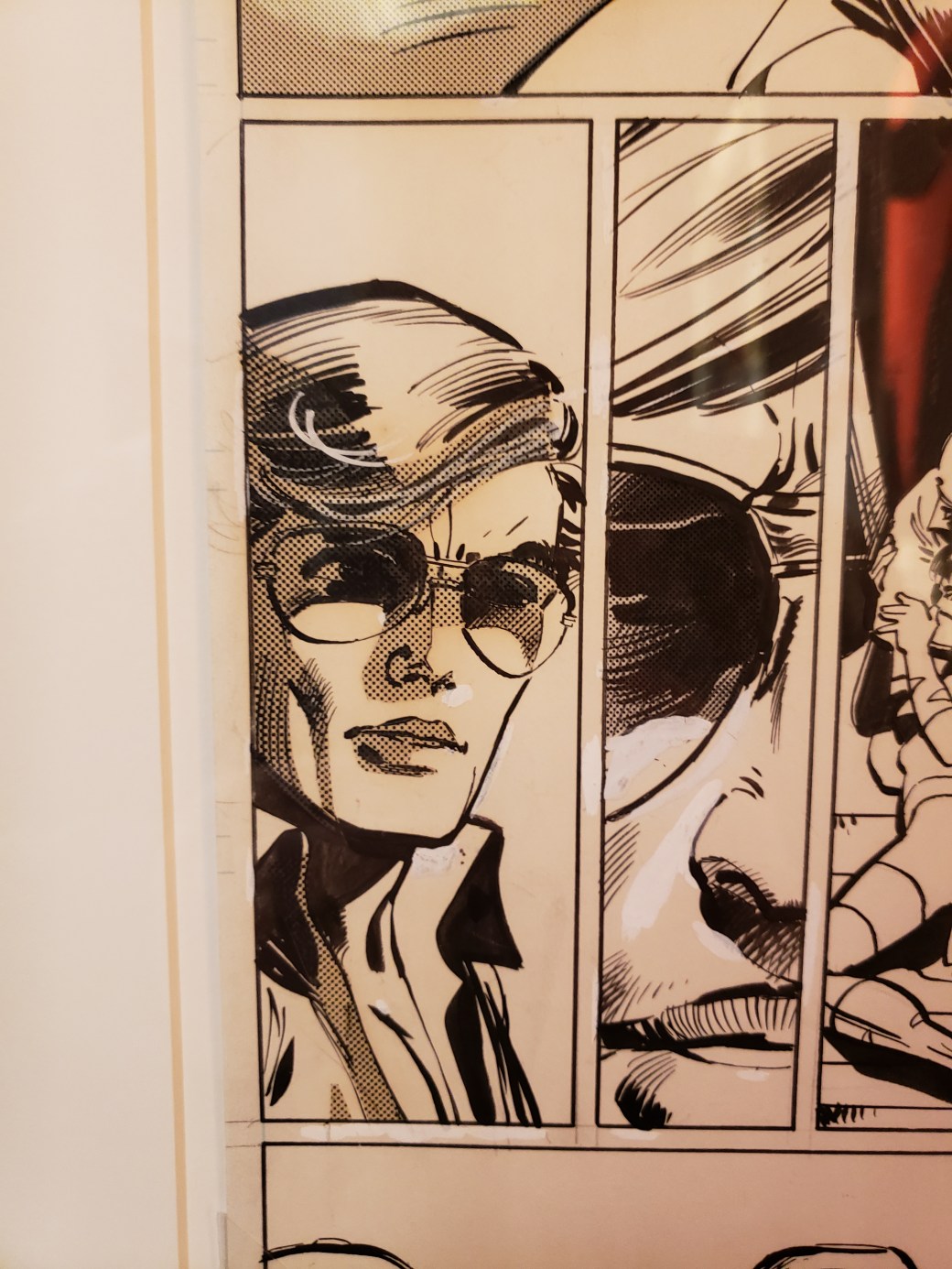
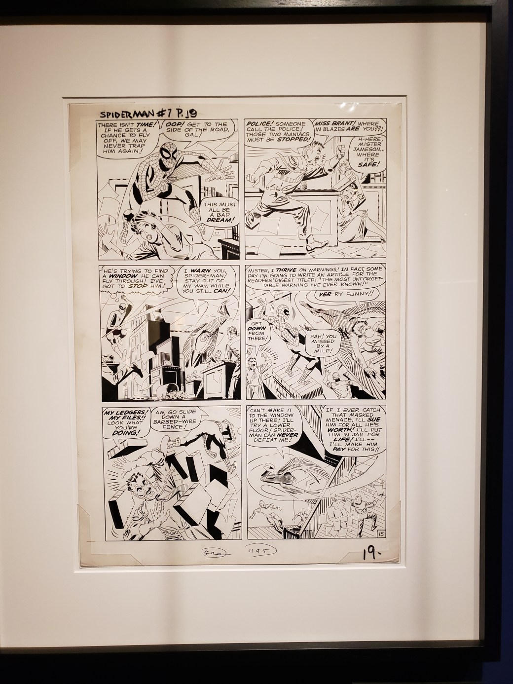
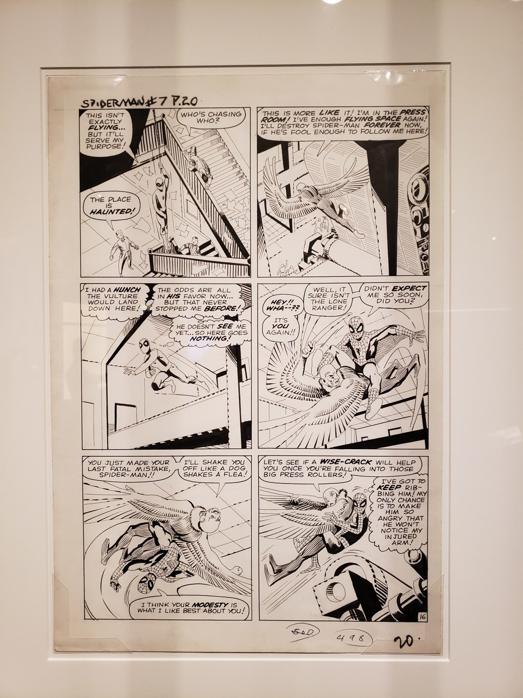
Prior to the MoPOP show, I had never seen a Ditko original before. To me, the hallmarks of his work were flat linework, wonky and stiff poses, and a general awkwardness. It was an appealing weirdness, particularly in his Dr. Strange work, but funky in a way that other artists were not. So imagine my surprise when I saw these original pages (from Amazing Spider-Man #7), and discovered that his linework wasn’t flat at all.
When you look at panel two, his influence on Frank Miller becomes apparent (look at J. Jonah Jameson’s pants), or on panel five, where he just blacks out sides of objects entirely. Newsprint isn’t famous for retaining detail of fine linework, but after years of having seen cheap reprints of his Spider-Man stories that flattened out his tapered, carefully chosen lines and hid them under flat colors, this was a revelation.
What I had, for years, interpreted as a lack of care in his inking, or a lack of flair, were revealed to be false impressions, From seeing these two pages in their unadulterated form, Ditko went from a Henley to a Clapton, someone who I’ve gotten over a lame first impression to appreciate more fully. If I had been around in the 1960s or 1970s, my opinion of Ditko would have been wildly different than having been introduced to his (not peak) work in the 1990s. His Spider-Man pages are exactly the same as they ever were, but it took an open mind and the proper presentation for the power of his work to register.
“Collaboration in art is the ultimate test of placing your ego aside in order to work toward a common idea. Artists often mention how creating art is like a dialogue – a conversation between the artist and the work… For this reason alone, mutual respect between art collaborators is very important…” Brian Sherwin, Fine Arts Review
As for the six artists in the editionvariable group, we are looking for the surprises these efforts will produce. We have reached the “third state” in our year-long collaboration, and adding our own interpretations to the images has been challenging and fun.
Moku hanga is a traditional Japanese form of woodblock printmaking notable for black outlines, vibrant colors, and angled perspectives (think of Hokusai and Hirosada). In modern times the images may have changed, but the process remains much the same, and its simplicity is very appealing, requiring not much more than a block of wood, a cutting tool (gouge), ink, and paper. The image, a type of relief print, is produced by carving away everything except the lines to be printed. To make a print, the block’s surface is saturated with water color and nori paste, and then slightly dampened paper is laid down and pressed with a buren. For multiple colors, multiple blocks are carved, with exact registration (kento) marks on each block. As the images are all hand-pulled, moku hanga prints don’t need a press, and using water-based inks makes this for an easy clean-up. McClains Printmaking Supplies is a good source for tools, blocks, and books about the process.
Carving can take a long time, but it’s an opportunity for contemplation, for “being in the moment” with your image, and the blocks eventually become works of art, along with the prints. San Francisco-based Bay Area Rapid Transit (BART) selected Berkeley artist Miwako Nishizawa, born in Kyoto Japan, to create pieces for its 2016 poster art series using the moku hanga woodblock technique.
Here are my first prints using this process. The first, “Breakfast Bee?” (the nuthatch and the bee), is in the Wingtip Press 2019 Leftovers print exchange. The other prints are entitled “Leafy Lullabies” (the crow is listening to, and looking for bugs under the leaves), and “Chrysanthemum” (inspired by a Hirosado print and an image of my niece).
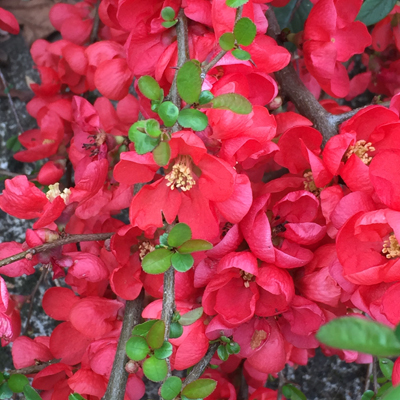
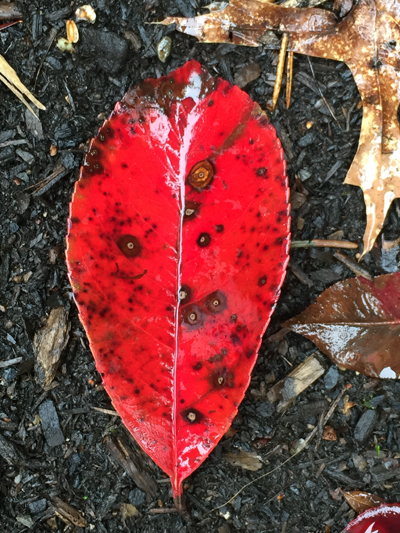
After an extended period of wintertime, spring is finally underway, and everything is turning green. But what keeps catching my eye is the color red – admittedly my favorite color and one that I use frequently in my work.
The flowering quinces(?) are in bloom, and the local varieties have a wonderful pinkish tinge. These shrubs are frequently encountered on my neighborhood walks with my dog.
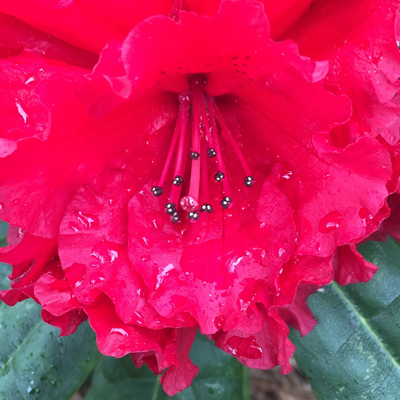
Closer to home, my Taurus rhododendron is in bloom, and the flowers are intensely red (and not as pink as they are in this photo). Closer inspection brings further reward, at least to my eye – these wonderful stamens with the black and white anthers.
Lastly, I came across this fallen leaf (from the evil photinia? next door), and I had to photograph it: the most perfect shade of red, glistening from rain, and the spots are fungal growths! Sheer perfection and inspiration…..
We are all familiar with successful collaborations. With this in mind, the editionvariable group has begun a year-long collaboration, and during this past month, our artists have exercised their imaginations, resulting in a 2nd state for these six works:
What is making me happy? Among other things, the recent work of 3 artists. Here they are, in no particular order:
Ruth Ross
Headache 2018
Ruth Ross worked in the publishing industry in New York City before moving to Portland in 2000. This extraordinarily versatile artist makes prints, paintings, collages, photographs and jewelry. http://ruthrossart.com
The New York Times Style Magazine recently did a long interview with Johns. https://www.nytimes.com/2019/02/18/t-magazine/jasper-johns.html
He currently has a show at the Matthew Marks Gallery in New York and in 2020 will have 2 shows split between the Whitney and the Philadelphia Museum of Art. He is 88 years old.
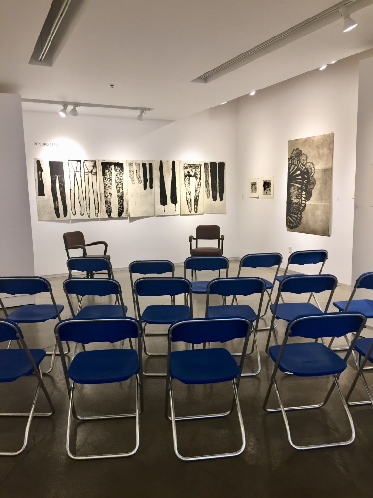
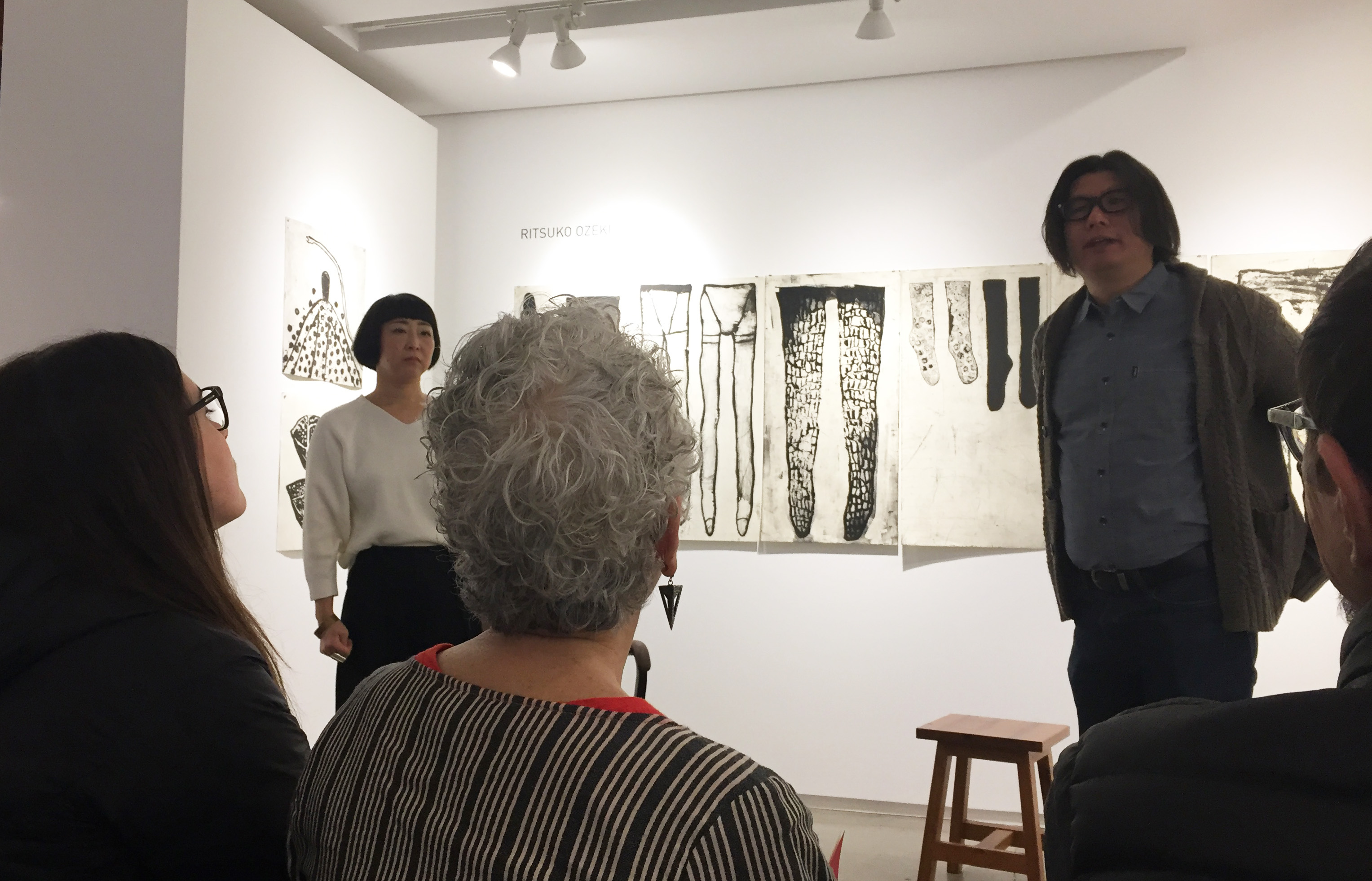
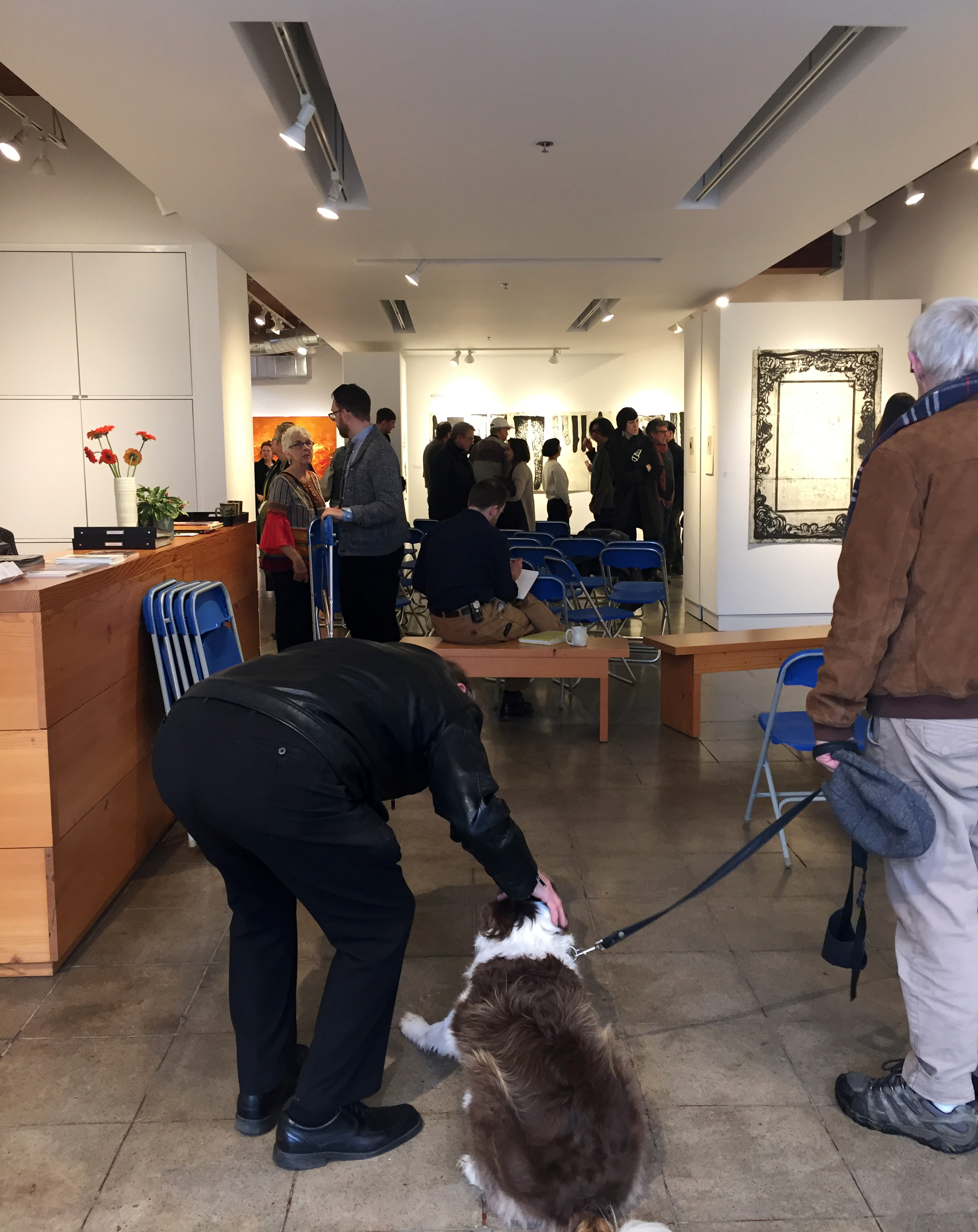
Last month I attended Ruth Ozeki’s artist talk on the occasion of her 20 year retrospective at the Froelick Gallery. It was a rare opportunity to listen to a Japanese printmaker share insights into her prints and her methods. Yoshihiro Kitai served as interpreter for Ms Ozeki and I scribbled down some quick notes. Most of the photos were taken with my phone and do not fully represent the quality of Ozeki’s prints. (I have noted one photo from the Froelick Gallery site.) I have tried to stay true to the translation of Ms Ozeki’s words about her life and her work.
Ritsuko Ozeki and Yoshihiro Kitai (and audience)
Ozeki describes herself as a quick printmaker. She studied calligraphy and it is an influence in her work. She makes her marks quickly and fluidly like a calligrapher. All of her prints are made with black ink. When asked why she doesn’t use color, Ozeki responded that the techniques to print in color are too complicated; they remove her from the way she like to make her marks. When she wants to work in color she paints.
Ozeki sketches constantly. She always carries her sketchbook (which she calls her journal) with her. Drawing is her life diary from which she later chooses images of interest to transfer onto copper plates. She does not draw in order to print, she draws as a way of recording her life.
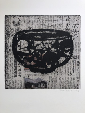
Generally speaking, Ozeki described the theme throughout her work as being of life and death. It is never figurative in content, allowing the viewer to import their own images and history onto the prints. She draws her content from every day life – stairs, vessels – into which she infuses her personal experience. (It is interesting to note that Ozeki embraces what she describes as the “accidental scratches” on the plate.)
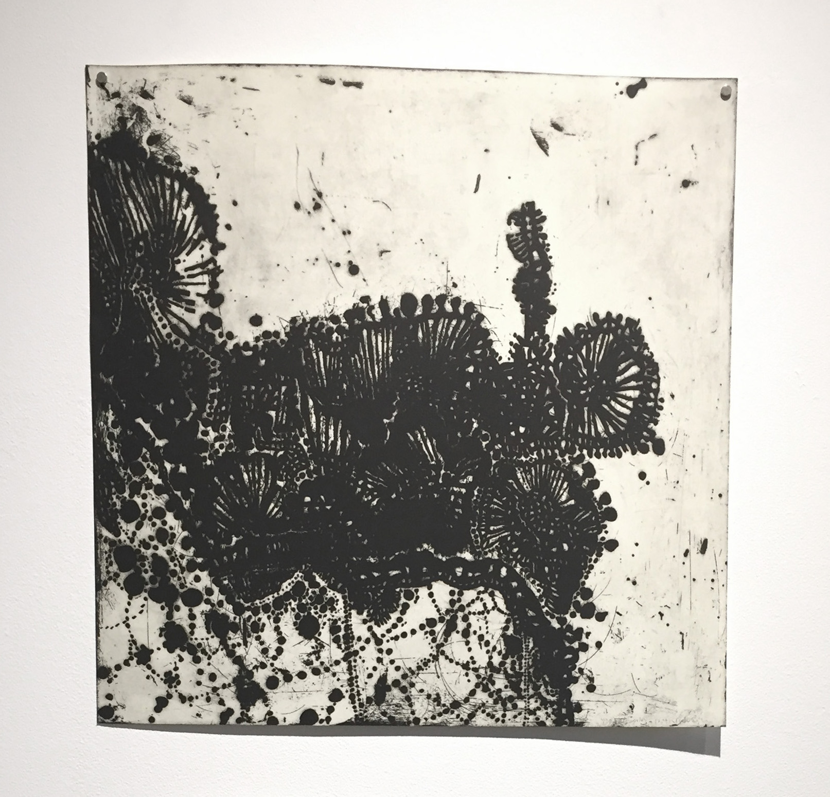
Lacework 2012 (lift ground etching, aquatint)
Ozeki started with an exploration of lace, then vessels including chine collé on newspaper. Lace and woven materials appear and re-appear. Her choice to use non archival materials is a considered one. She views the shift in color of newsprint as an indicator of daily life.
24 on the news 2009 (*from Froelick Gallery) (lift ground etching, aquatint chine colléº
The most significant evolution of Ozeki’s prints began after her mother’s passing away. Initially, Ozeki described her work as being more poetic; after her mother’s death the prints became more about feelings and magic.
from the “Slough” series (many more available) (lift ground etching, aquatint)
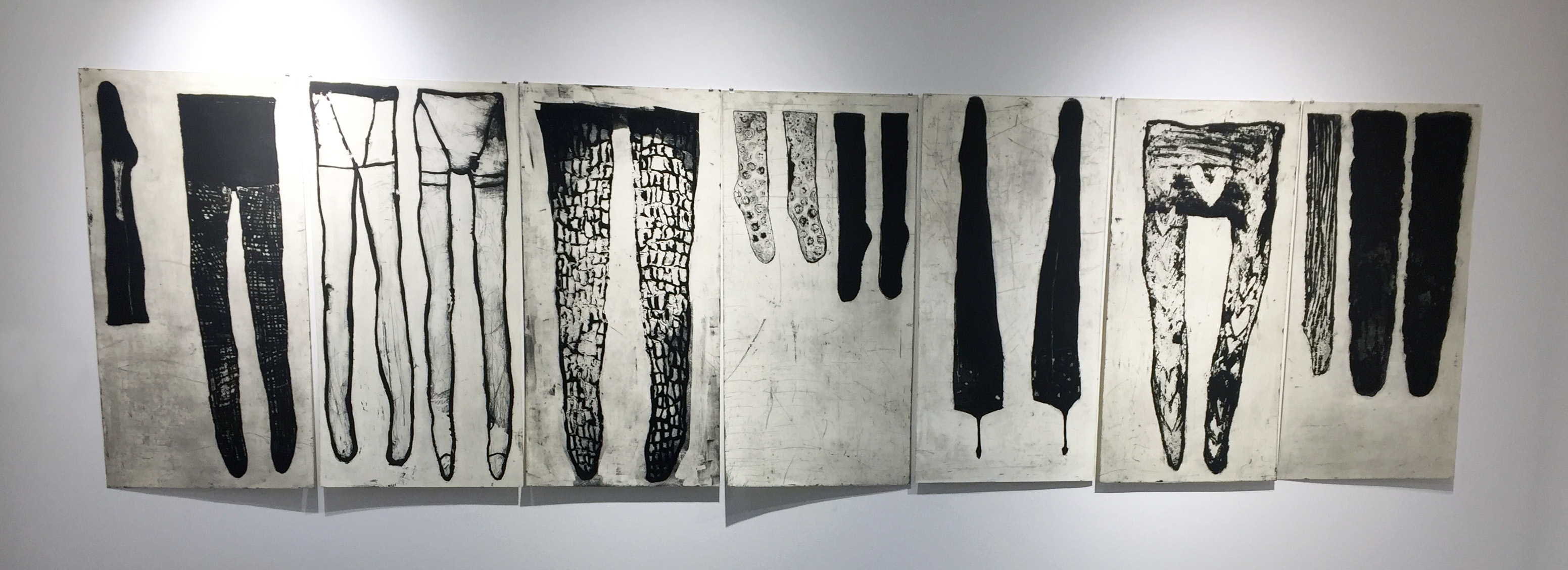
Ozeki found a collection of stockings in her mother’s possessions after her death. The resulting “Slough” series is about the female’s life from baby clothing to the stockings. Vessels evolve from two hands joining to make a bowl to bring food, liquid to the mouth. Upon death, ashes are contained in an urn – another kind of vessel. The last vessel.
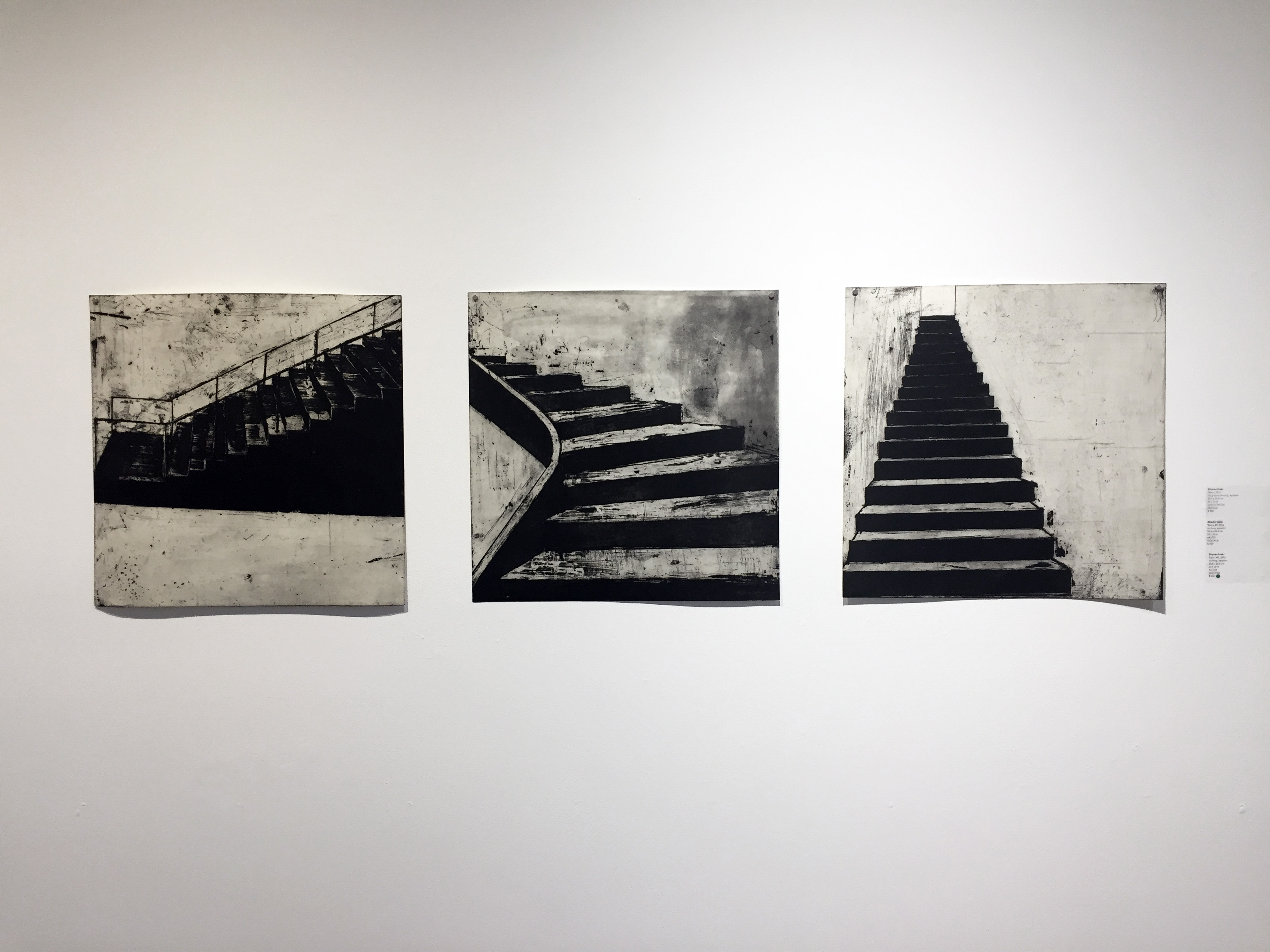
Not only has Ozeki experienced loss, she is also a survivor of the 2011 earthquake in Japan. Ozeki began to explore architectural forms, always mindful of the large loss of life. Stairs were often the only thing left standing. Not only do they represent structural stability but the transition from one place to another.
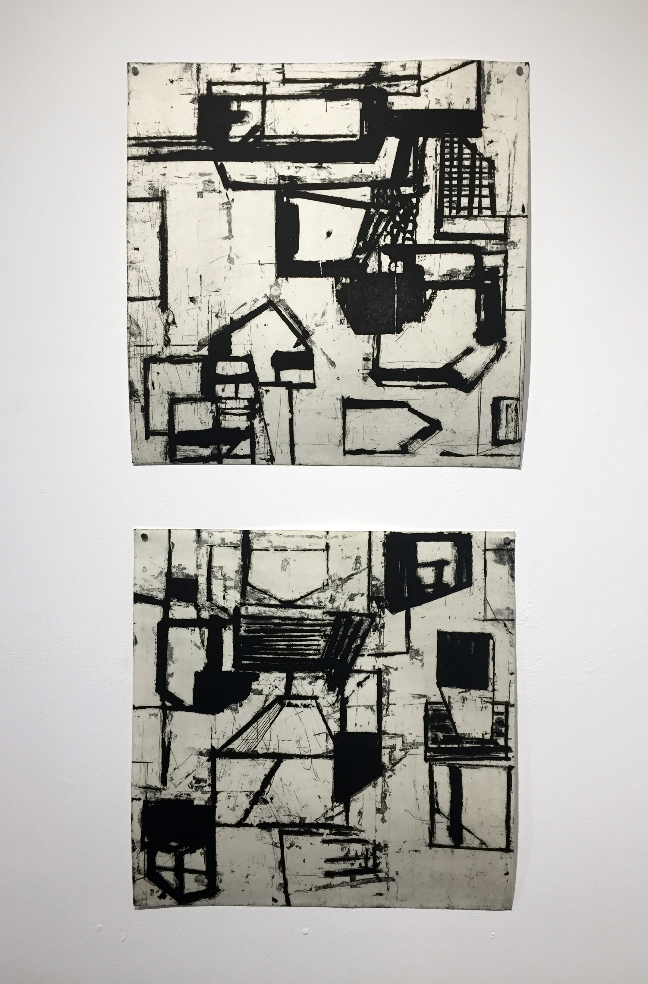
Ozeki has also experienced houses being tossed upside down and a chaos of structure. She developed house forms which she printed in every direction.
Town #2 2017, Town #1 2017 (etching, aquatint)
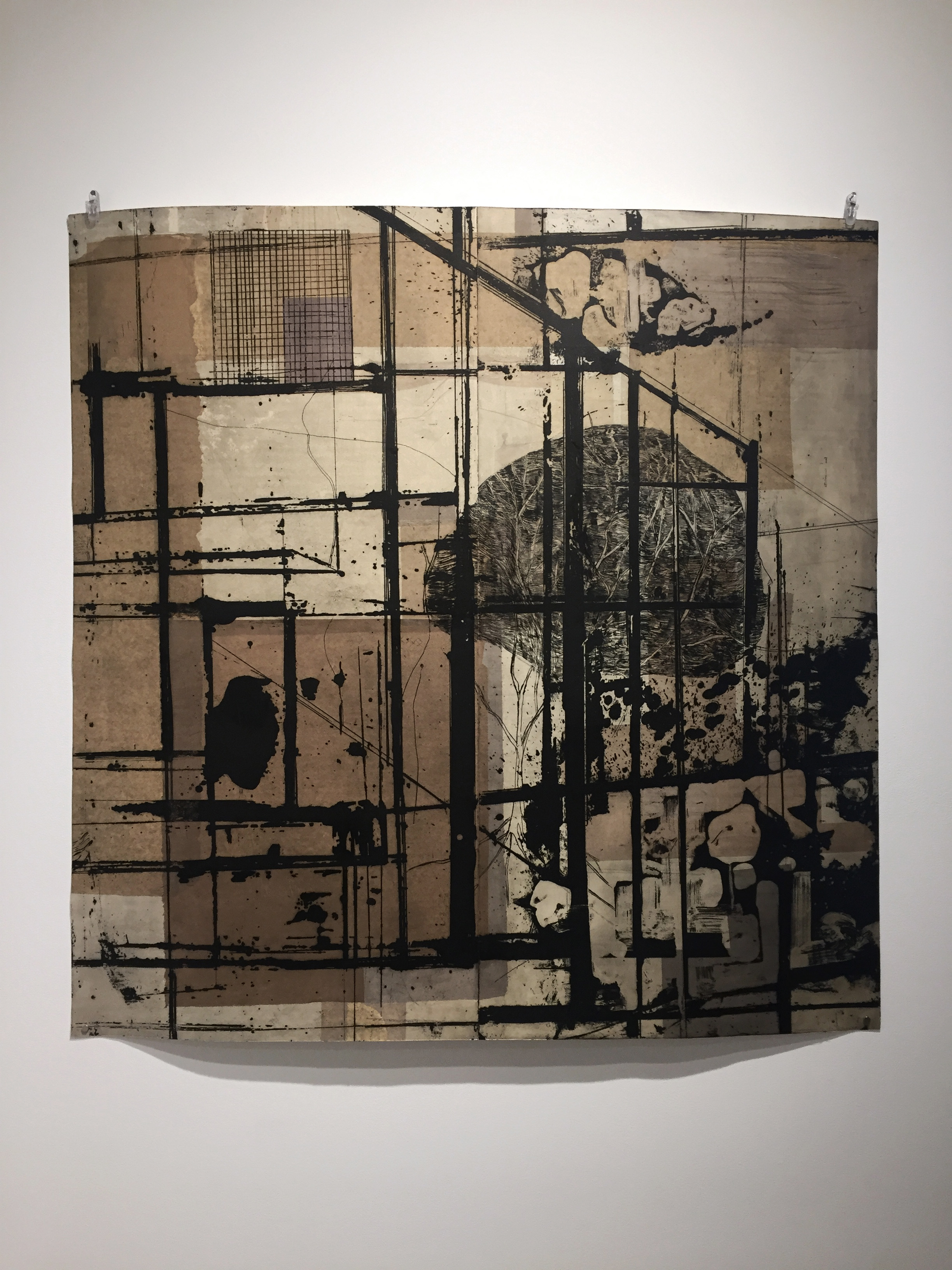
The exploration of architectural forms continues into the period of restoration. This print (below) was the most current of the exhibit and the largest at 39″ x 39″.
This print exhibit is one of the few that I have attended where none of the prints were framed. Being able to stand close to the work and follow the mark making was an intimate experience. The paper was allowed to buckle on the wall and cast shadows. As particular as I am about framing, I appreciated this more raw and trusting presentation of the work.
The talk was well attended by a mix of printmakers, artists in other media and collectors. Ms Ozeki was generous with her time and responses. When asked why she simply doesn’t draw what she wants to share, she responded that when she works on copper and pulls the paper back on the press, she feels the hand of God in her images. Most in attendance recognized that feeling. I learned some things about process but mostly this talk reinforced lessons I am already working on. I need to draw more = I can’t draw enough. I need to stay close to the subjects that touch my emotions deeply – being timid is not an option. Regardless of the difference in language and culture, the bones of creativity and sharing your work are universal. I spoke with Ms Ozeki after the talk – even without a lot of common words, I felt a strong sense of recognition.
We are all familiar with artists whose collaborations have sparked synergy in their work. Our Edition Variable group plans a collaboration in which each of our six artists creates an image on 22″ x 30″ paper using any media. Each month these pages are exchanged and transformed using line, color, collage, stitchery, erasure, etc., so that after a year, each artist will have visited each page twice. Like the wardrobe door into Narnia, or Alice’s rabbit hole, these pages will invite our artists into a magical place.
Here are some close-ups of our beginning images. Stay tuned for our monthly transformations!